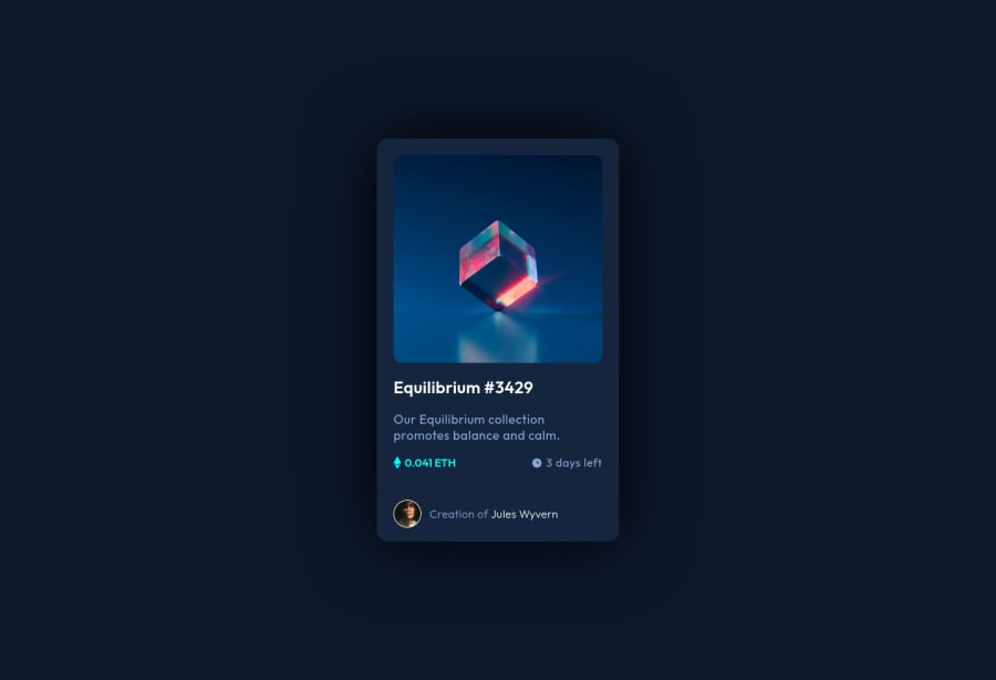
nft preview card component with css grid and flexbox
Design comparison
Solution retrospective
I've struggled a bit to make the icon and the transparent color appear simultaneously. Also, I am unsure about the readability of my code. Other than those, it was a fun and quick project. Feedbacks welcome.
Community feedback
- Account deleted
Hey, some suggestions to improve you code:
- To give you HTML code structure, you want to set up your code in the following manner (only did parent containers):
   <body>
        <main>
          <article class=“card-container”></article>
        </main>
      </body>
The Main Element identifies the main content of the document.
While the Article Element will serve as the card’s container, because the card represents a complete, or self-contained, section of content that is, in principle, independently reusable.
More info:
https://web.dev/learn/html/headings-and-sections/
- The Background Image Property is only to be used on decorative images. NOT images that add value and serve a purpose. For this challenge you want to use the Image Element.
Once you fix the image issue, You'll want to include an Alt Tag with it. You want it to describe what the image is; they need to be readable. Assume you’re describing the image/icon to someone.
- Wrap the "NFT image", "Equilibrium #3429" and "Jules Wyvern" in an Anchor Tags <a> not a button element. The anchor tag will allow users to click on content and have them directed to another part of your site.
Happy Coding! 👻🎃
Marked as helpful0@ayseakimsarPosted over 2 years ago@vcarames Hello! Thanks for reviewing my code and leaving that very helpful and comprehensive comment. I am very appreciative of each piece of advice. 🙌
0 - @kostyafarberPosted over 2 years ago
Hey there!
Really great solution 🚀 I think your code is well laid out and structured.
A couple of suggestions:
- Make use of the
maintag. It is good practise to use semantic HTML to make the structure of your page more readable. Every page should have amaintag. - Delete your comments from your CSS! It will make it easier to read and reduce unnecessary code :)
- Try using a pseudo element for the hover effect. You can use something like
::before. This will reduce and declutter the html.
Overall really good stuff.
Happy coding!
If you found my comment helpful please mark it as helpful! Thanks 🙂
Marked as helpful0@ayseakimsarPosted over 2 years ago@kostyafarber Hello! Incredible feedback and very constructive suggestions. Thank you so much!
0 - Make use of the
Please log in to post a comment
Log in with GitHubJoin our Discord community
Join thousands of Frontend Mentor community members taking the challenges, sharing resources, helping each other, and chatting about all things front-end!
Join our Discord
