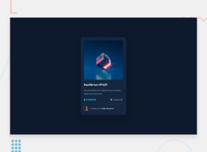
Design comparison
SolutionDesign
Solution retrospective
What are you most proud of, and what would you do differently next time?
I used translate property with the view icon to center it. It was useful because I haven't worked so much with that tool.
What challenges did you encounter, and how did you overcome them?.icon-view { translate: -50% -50%; }
It was difficult to work with the active state of the main image. I found myself working with something relatively new. I tried using ::before pseudo-element, but it just didn't work for me. So, I used a layer above the main image to simulate that it changes its color. I apply a background color of cyan to it, and an opacity of 0.5.
.layer {
        display: none;
  background-color: var(--cyan);
  opacity: 0.5;
}
.nft-preview-card-component__img-container:hover .layer {
  display: inline-block;
}
I'll appreciate any improvement to my code. Feedback is always welcome!
Community feedback
Please log in to post a comment
Log in with GitHubJoin our Discord community
Join thousands of Frontend Mentor community members taking the challenges, sharing resources, helping each other, and chatting about all things front-end!
Join our Discord
