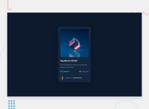
Design comparison
Solution retrospective
Hello there! This is my code solution for the NFT preview card component challenge.
I would love to receive some feedback. I'm eager to learn and improve my coding skills, so any constructive criticism or suggestions for improvement would be greatly appreciated.
Thank you in advance for taking the time to review my work, and I look forward to hearing your thoughts!
Community feedback
- @visualdennissPosted over 1 year ago
Hello, Deepali Panchal, congrats on completing the challenge successfully! I've been checking some other submissions of your as well but they all looked perfectly, respond very well to all screen sizes, so there was nothing i could add at all, but in this one, i've found something i can suggest now :D It looks like when hovering over the image, the overlay's border-radius does not match to the image. Additionally, if you want to enhance it little further, you can add some slight transition effect from opacity: 0 to opacity: 1 when hovering with e.g. transition: opacity .4s easeInOut; for a smoother effect. Keep up the great work.
Hope this was helpful!
Marked as helpful0 - @vanzasetiaPosted almost 2 years ago
Hello, Deepali Panchal! One suggestion I have is to leave the alternative text empty for the Ethereum and clock icons. Those are decorative images. Meaning, they don't have useful information. This will tell the screen reader to skip them. As a result, it saves screen reader users time navigating the page.
Marked as helpful0@Deepali25-KPosted almost 2 years ago@vanzasetia Thank you for the suggestion! I will definitely keep this in mind when working on web development projects in the future.
0
Please log in to post a comment
Log in with GitHubJoin our Discord community
Join thousands of Frontend Mentor community members taking the challenges, sharing resources, helping each other, and chatting about all things front-end!
Join our Discord
