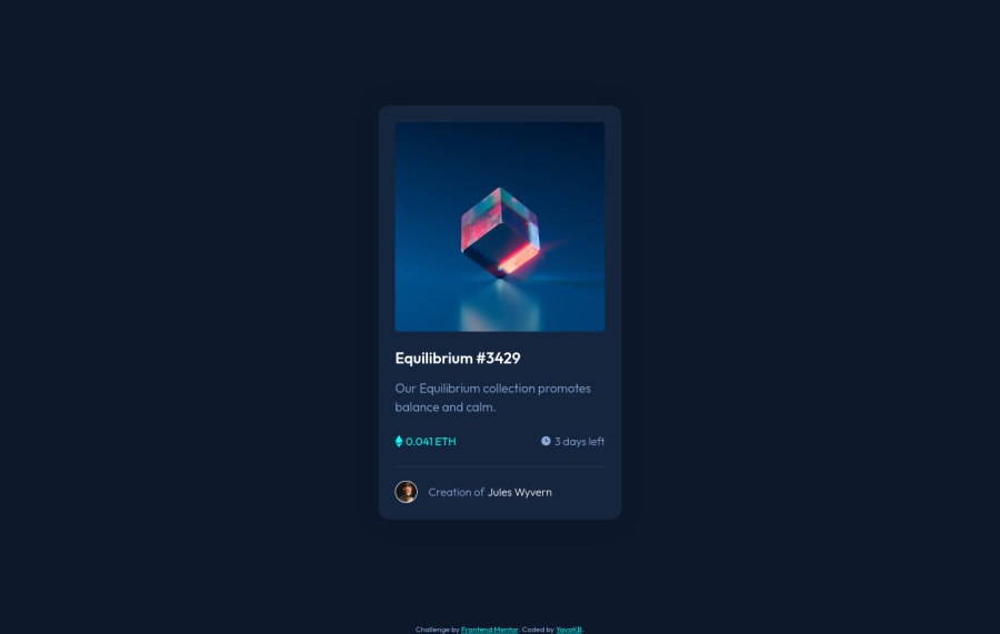
Design comparison
SolutionDesign
Community feedback
- @kristiingcoPosted over 2 years ago
Hey there! First off, great solution.
Using flex on the parent divs (your divs with the class of ".price" and ".time") will allow you to align the text and their respective images.
.price {
  color: var(--cyan);
  font-size: 1rem;
  font-weight: 400;
  display: flex;
}

.time {
  color: var(--soft-blue);
  font-size: 1rem;
  font-weight: 300;
  display: flex;
}
This, however, will result in the icons being "squished", due to the default alignment of the items being set to stretch. Thus, you have to add the "align-self" property to the CSS declarations you did for the icons.
.time img,
.price img {
  margin-right: 0.25rem;
  align-self: center;
}
I cloned your repo and added the above changes and it should look like this!
1@YayoKBPosted over 2 years ago@kristiingco Thanks! Adding flex worked :) Such a simple fix...
0
Please log in to post a comment
Log in with GitHubJoin our Discord community
Join thousands of Frontend Mentor community members taking the challenges, sharing resources, helping each other, and chatting about all things front-end!
Join our Discord
