Design comparison
Solution retrospective
Hello dear devs 👋
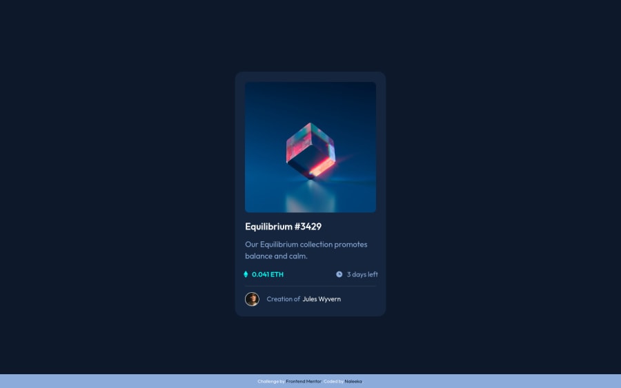
This is my solution for the NFT preview component challenge
I've added some hover effects
Leave your thoughts 👩🚀
Community feedback
- @PhoenixDev22Posted over 2 years ago
Hello Naleeka,
Congratulation on completing another frontend mentor challenge. I have some suggestions regarding your solution:
- The most important part in this challenge is the interactive element. Since there's a :hover state on the image and means it's interactive, So there should be an interactive element around it. When you create a component that could be interacted with a user , always remember to include interactive elements like(button, textarea,input, ...) For this imagine what would happen when you click on the image, there are two possible ways:
1: If clicking the image would show a popup where the user can see the full NFT, here you use
<button>.2:If clicking the image would navigate the user to another page to see the NFT, here use
<a>.- You should have used
<a>to wrapEquilibrium #3429 and Jules Wyverntoo.
- For any decorative images, each img tag should have empty
alt=""and addaria-hidden="true"attributes to make all web assistive technologies such as screen reader ignore those images in (icon-view, icon-ethereum, icon-clock).
- Profile images like that avatar are valuable content. The alternate text of the avatar’s image should not be Creator avatar. You can use the creator's name
Jules Wyvern. Read more how to write an alt text
- Never use
<div>and<span>alone to wrap a meaningful content. Just keep in mind that you should usually use semantic HTML in place of the div tag unless none of them (the semantic tags) really match the content to group together. By adding semantic tags to your document, you provide additional information about the document, which aids in communication.
- You can use unordered list
<ul>to wrapclass="vals". In each<li>should be<img>and<p>.
- There are so many ways to add the hover effect on the image , The one I would use, using pseudo-elements to change the teal bg color to a hsla. Then opacity can be changed from 0 to 1 on the pseudo element on hover. There is no need for a extra clutter in the HTML. The icon view does not really need to be in the HTML. You can use CSS for it.
- Adding
rel="noopener"orrel="noreferrer"totarget="_blank"links. When you link to a page on another site usingtarget=”_blank”attribute , you can expose your site to performance and security issues.
The
titleattribute is shown as a tooltip when you hover over the element, most of the time it doesn’t even make sense to add it. They are only available to people who use a mouse (or other pointing devices) and the only one case where the title attribute is required for accessibility is on<iframe>and<frame>tags. The alt tag is used by screen readers, which are browsers used by people with a visual impairment for example. These screen readers tell them what is on the image by reading the alt tag.hopefully this feedback helps.
Marked as helpful1@NaleekaPosted over 2 years ago@PhoenixDev22 Thankyou for the well detailed comment.
I will make the changes ASAP
1
Please log in to post a comment
Log in with GitHubJoin our Discord community
Join thousands of Frontend Mentor community members taking the challenges, sharing resources, helping each other, and chatting about all things front-end!
Join our Discord
