Design comparison
SolutionDesign
Solution retrospective
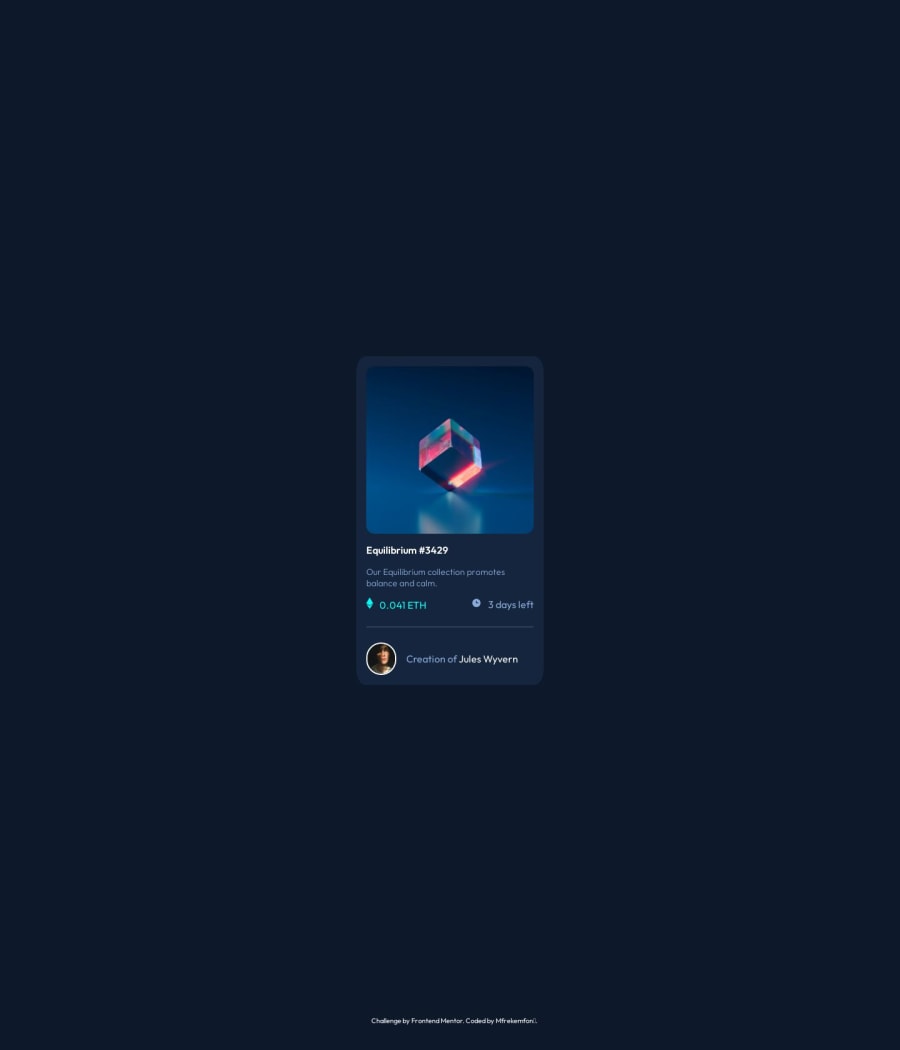
Hey everyone, so I had a tough time with making the icon-view.svg file hover in the center of the main image. Also, in this project, I tried to make the design consistent on some screen sizes, so if anyone has any thoughts on this or the project as a whole, I'd really love to hear them in the comments!
Community feedback
- @gfunk77Posted 12 months ago
Nice job on your solution. I can see that you were successful in creating the hover effect and eye. Nice! I have a few general comments that I hope are helpful.
- please format your code. highlight everything and right click, there should be an option to format. This will make it a lot easier for others (and you!) to review your code.
- on your parent container, in your case the body, add a
min-height: 100vh;This will make the viewport a minimum of 100% and take away the scroll. - I can see that for your classes you are using the tag name with a dash like this
<p class="p-1></p>"It will be much better to use actual names because you are going to have many, many p's and div's in your projects. No one will remember whatclass="div-43"will refer to. I'd look into a system like BEM if some structure is what you need. - You don't have to put the <svg> directly into your code. You can use <img src=" path/to/your/image/file" /> This is better especially because svgs can be thousands of lines of code.
I hope all this is helpful.
Marked as helpful2@MfrekeePosted 12 months ago@gfunk77 Thank you, I'd do all that and commit the new changes.
0
Please log in to post a comment
Log in with GitHubJoin our Discord community
Join thousands of Frontend Mentor community members taking the challenges, sharing resources, helping each other, and chatting about all things front-end!
Join our Discord
