Submitted over 2 years ago
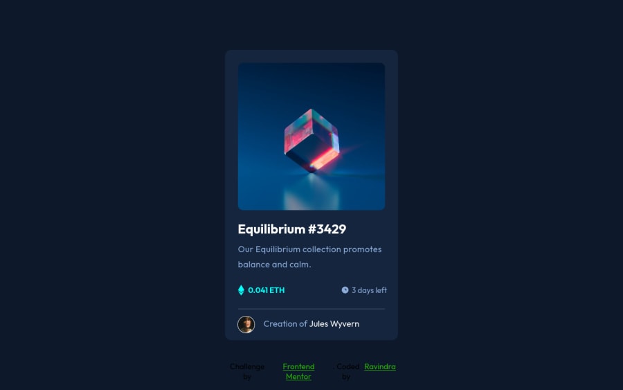
NFT preview card component using html and css
@socoolRK
Design comparison
SolutionDesign
Solution retrospective
I have completed another challenge from a front-end mentor but I have a problem regarding the hover effect of icon-view and background color on the top image so if anyone has any suggestions on how to overcome that problem then I will appreciate the valuable feedback.
Community feedback
- @denieldenPosted over 2 years ago
Hi Ravindra, great work on this challenge! 😉
Here are a few tips for improve your code:
- add
maintag and wrap the card for improve the Accessibility - You can add the effect
:hovercreating adivthat appears on hover. I used tailwind but you can still see and understand which css properties you can use to do the same. Look here -> my solution - add
transitionon the element with hover effect - instead of using
pxuse relative units of measurement likerem-> read here
Overall you did well 😁 Hope this help!
0 - add
Please log in to post a comment
Log in with GitHubJoin our Discord community
Join thousands of Frontend Mentor community members taking the challenges, sharing resources, helping each other, and chatting about all things front-end!
Join our Discord
