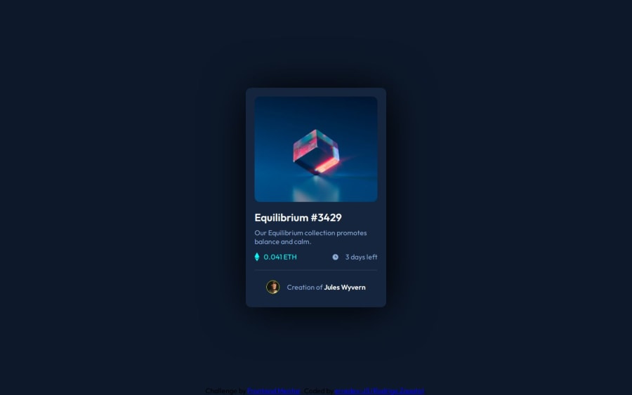
Design comparison
SolutionDesign
Solution retrospective
The overlay was so difficult to do, but this is the result, thx for watching
Community feedback
- @danielmrz-devPosted 10 months ago
Hello @roddev0!
Your solution looks great!
I have one suggestion:
- Use a lighter color for the text of the card. Currently is almost impossible to read its content. This is not just because of the design. The background colors and texts must have a good contrast. This change improves the accessibility of your project
I hope it helps!
Other than that, you did an excelent job!
Marked as helpful1@erredev-JSPosted 10 months ago@danielmrz-dev Hi again Daniel! thanks for your feedback, i didn't notice the color of the text was wrong.
Im going to correct that.
1
Please log in to post a comment
Log in with GitHubJoin our Discord community
Join thousands of Frontend Mentor community members taking the challenges, sharing resources, helping each other, and chatting about all things front-end!
Join our Discord
