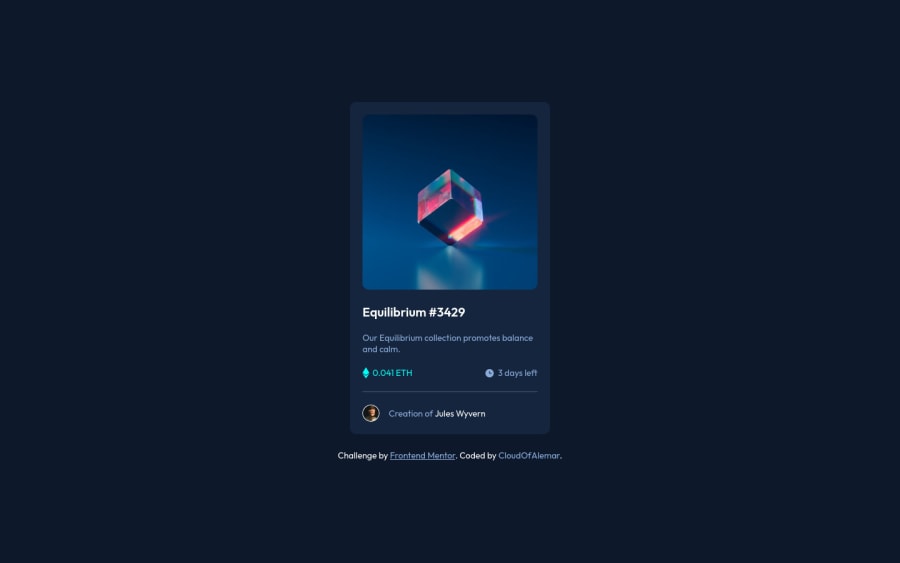
NFT Preview Card Component Using HTML and CSS
Design comparison
Solution retrospective
Hello everyone, I'm starting to feel more comfortable creating these designs since the first three projects were sort of similar. If there's any way I can improve my code please let me know, thank you :)
Community feedback
- @Md-Raihan-AlamPosted over 2 years ago
You forgot to add ALL the hover effects in this project, It is pretty important you go through all the project pictures( if you are using a free account) or Figma design(if pro account). I checked your site, all seems good except the hover effects are missing.
In real-life work, you will be provided Figma or similar designs to develop the sites so that you can understand the the width, hight or any small details that needs to be consider, From doing it pictures it pretty much on your own
0@CloudOfAlemarPosted over 2 years ago@Md-Raihan-Alam , hello ππ» and yes I was just looking at that! I was in a rush and I completely forgot to add the hover effects and I also see a box shadow around the card feature. I will definitely have to resubmit this. Thank you for your feedback I appreciate it ππ»
0
Please log in to post a comment
Log in with GitHubJoin our Discord community
Join thousands of Frontend Mentor community members taking the challenges, sharing resources, helping each other, and chatting about all things front-end!
Join our Discord