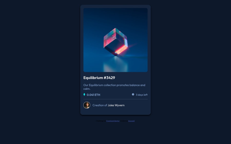
Design comparison
Solution retrospective
I have some issues. I couldn't make the image hover when a cursor moves along it. And I don't know it isn't responsive. Please I'll really need help here.
Community feedback
- @HassiaiPosted over 1 year ago
There is no need to give the body a width and height value and the main a width value.
To center .card on the page using flexbox, add min-height: 100vh to the body.
For a responsive content which wont require a media query for this challenge, replace the width in .card with max-width.
Use relative units like rem or em as unit for the padding, margin, width values and preferably rem for the font-size values, instead of using px which is an absolute unit. For more on CSS units Click here
Hope am helpful.
Well done for completing this challenge. HAPPY CODING
Marked as helpful1@SixcoolZPosted over 1 year agoI did as you said and it worked. It was responsive. Thanks for helping out. Finally got to learn not to apply width and height to the body, and main. Thanks for the tip. I got another issue that still hasn't been resolved yet, how can I make my image active when the cursor hovers around it. That's the only challenge I wasn't able to resolve in this task. Thanks. @Hassiai
0@HassiaiPosted over 1 year ago@SixcoolZ
Wrap the img in a figure tag.
<figure> <img><div class = "middle"><i></i></div></figure>give the figure a width of 100% and position: relative, give .middle position: absolute, left, top, bottom and right of 0 , a background-color of cyan and opacity of 0.
For the hover effect of the image give img:hover .overlay opacity of 0.9 and a cursor value of pointer.
figure{
width:100%;
position: relative;
}

.middle{
position: absolute;
right:0;
left:0;
top:0;
bottom: 0;
 background-color: hsl();
opacity:0;
}
img{
width:100% ;
display: block;
}
img:hover .middle{
opacity: 0.09;
cursor: pointer;
}
give the styling you gave to . middle to . middle i{}.
Hope am helpful
Marked as helpful0@SixcoolZPosted over 1 year agoI did it but the image wasn't active. I've pushed it so you'll see how it is showing after I applied it. Please check it out. Thanks. @Hassiai
0@SixcoolZPosted over 1 year agoPlease I am still expecting your further feedback on it. Thanks. @Hassiai
0@HassiaiPosted over 1 year ago@SixcoolZ
replace .equllibrium:hover .middle {} with
figure:hover .middle{}.to center the view icon in .middle give . middle i { position: absolute; left: 50% ; top: 50% transform: translate(-50%, -50%);}
Am sorry for the late reply
Marked as helpful0@SixcoolZPosted over 1 year agoI did it and it worked. Thanks for the help and I've pushed it. Please I've another question, how can I make my eye icon be more sharp? It's looking more light in my eye. Thanks and I really appreciate. @Hassiai
0
Please log in to post a comment
Log in with GitHubJoin our Discord community
Join thousands of Frontend Mentor community members taking the challenges, sharing resources, helping each other, and chatting about all things front-end!
Join our Discord
