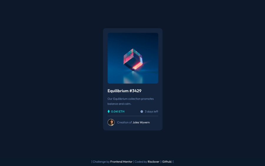
Design comparison
Solution retrospective
This one was fairly simple for me! In fact, I was able to complete it in well under an hour, and I'm mad proud of myself for honing my HTML and CSS skills that far.
Any feedback you can provide would be nice. I did have a bit of trouble with the hover effect over the image, so any cleaner solutions would be greatly appreciated!
Community feedback
- @A-amonPosted over 3 years ago
Hello! Great job for this. It looks very responsive too~ 😀
1@RiscloverPosted over 3 years ago@A-amon Hi! Thank you very much for the feedback.
I've never really used before/after pseudo-elements. I know what they are, but for some reason, I've never really learned how to use them. If you have the time, would you mind explaining to me how using that strategy works for the icon hover?
1@A-amonPosted over 3 years ago@Risclover Hello, here is the code for the eye icon using pseudo-element 😀:
/* * * * * * * * * * * * * * * * * * * * * * * * * * * * * * * * * * * * *
* Show eye icon when .heroimg is hovered on
* * * * * * * * * * * * * * * * * * * * * * * * * * * * * * * * * * * * */
.heroimg:hover::after {
    content: "";
    height: 3rem;
    width: 3rem;
    display: block;
    background-image: url("images/icon-view.svg");
    background-size: contain;
    position: absolute;
    top: 0;
    bottom: 0;
    left: 0;
    right: 0;
    margin: auto;
}
I usually use pseudo-elements for small decorative images like icons or for overlays 💭. Refer here to know about how screen readers treat them
1 - @legion40216Posted over 3 years ago
Well done...
0
Please log in to post a comment
Log in with GitHubJoin our Discord community
Join thousands of Frontend Mentor community members taking the challenges, sharing resources, helping each other, and chatting about all things front-end!
Join our Discord
