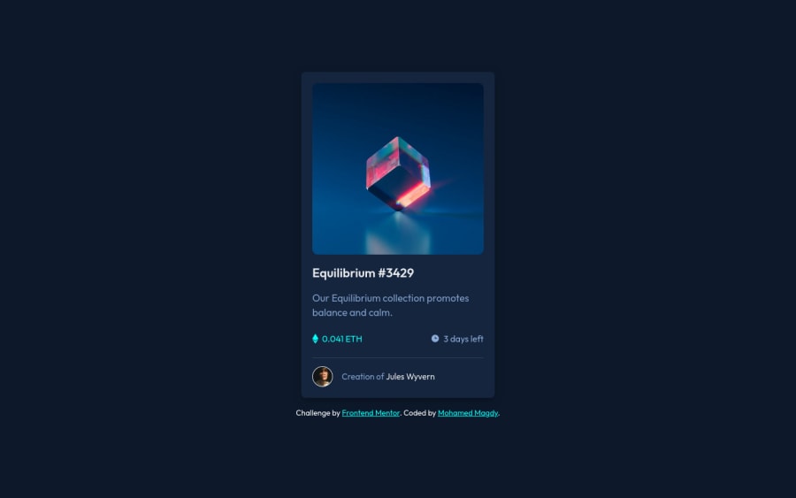
nft preview card component using html and css
Design comparison
Solution retrospective
I would love to see some suggestion to keep improving
Community feedback
- @visualdennissPosted almost 2 years ago
4 - Add cursor: pointer; to the interactive elements like the links or the overlay/img to indicate interactivity to the user.
Marked as helpful1 - @DXXDLYPosted almost 2 years ago
Great work!
Here are some changes to your code
- Use the same units of measure for padding and element sizes. The code uses different units of measure (such as pixels and rhemes), making the code difficult to understand and debug. It is recommended to use the same unit of measure for padding and dimensions, such as rhemes.
2.Use more declarative class names. The class names like .card, .img-container, .creation do not give any idea of what these elements represent. It is recommended that you use more specific class names that more accurately describe the elements.
3.For better readability, it makes sense to group CSS properties by type, for example defining font properties first, then colors, and so on.
- Fill in the alt attribute of the image
Hope you find this feedback helpful!
Marked as helpful1@mohamed-magdy26Posted almost 2 years ago@DXXDLY I appreciate your help. It's so beneficial, but isn't the alt attribute for the image a decorative image? I should leave it empty.
0@DXXDLYPosted almost 2 years ago@mohamed-magdy26
The "alt" attribute is used to describe the content of an image on a web page and is intended to improve the site's accessibility for people with disabilities. And It can also be useful for search engine optimization and user experience.
0
Please log in to post a comment
Log in with GitHubJoin our Discord community
Join thousands of Frontend Mentor community members taking the challenges, sharing resources, helping each other, and chatting about all things front-end!
Join our Discord
