Design comparison
Solution retrospective
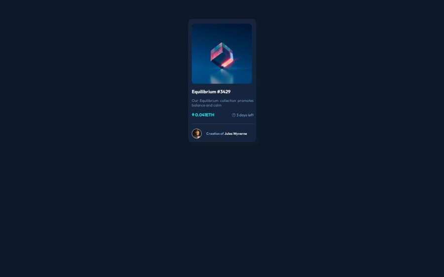
I. kind of had trouble in aligning the layout and design, but I hope by working out these challenges would help me improve my skills in HTML and CSS.
Community feedback
- @SvitlanaSuslenkovaPosted 6 months ago
body { display: flex; flex-direction: column; justify-content: center; align-items: center; min-height: 100vh; } Try this to align(top-bottom) and justify(left-right) your project to the center. It applies to the parent component(body), don't forget about !!min-height!!. You can use grid instead of flex too.
Marked as helpful0@AmalaAnnJerryPosted 6 months agoThanks for your review. I tried it out it worked!!.Do you know any platform from where I can learn about all these concepts on HTML and CSS ?@SvitlanaSuslenkova
0@SvitlanaSuslenkovaPosted 6 months ago@AmalaAnnJerry I used https://www.w3schools.com/css/default.asp as a beginner. Was very easy to read.
0
Please log in to post a comment
Log in with GitHubJoin our Discord community
Join thousands of Frontend Mentor community members taking the challenges, sharing resources, helping each other, and chatting about all things front-end!
Join our Discord
