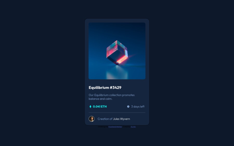
Design comparison
Solution retrospective
I found target certain elements slightly challenging, as several elements had the same margins, but I didn't want to have an impact on the margins of their children. I wanted to keep individual targeting down to a minimum to keep the code as clean as possible. And I guess that is the thing I am most unsure of: whether or not the code in the end is clean or not. One thing that I was wondering about as well: How do I ensure what I had in the end was as close to the model images as possible. Besides the font size for the paragraph being provided, I had to eyeball everything else. Are there any best practices in this regard?
Community feedback
Please log in to post a comment
Log in with GitHubJoin our Discord community
Join thousands of Frontend Mentor community members taking the challenges, sharing resources, helping each other, and chatting about all things front-end!
Join our Discord
