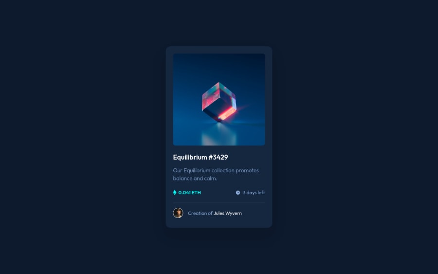
Design comparison
Solution retrospective
A little bit more challenging with the hover effects.
I found that the shadow was hard to make I couldn't get that right.
Any feedback would be great (especially on correct practices whilst coding).
//corrected some of my accessibility mistakes. 03/02
Community feedback
- @vanzasetiaPosted almost 3 years ago
š Hi Arthur!
š Congratulations on finishing this challenge!
Yeah, the most challenging part is to create the hover effect and at the same time making sure that it is accessible.
I have some feedback on this solution:
- Accessibility
- I would recommend using interactive elements (
a
) for any elements that have:hover
or:active
states. - Create a custom
:focus-visible
styling to any interactive elements (button
, links,input
,textarea
). This will make the users can navigate this website using keyboard (by usingTab
key) easily. - Always wrap text content with meaningful tag (
p
). It might not be accessible if you are usingspan
as the main element that wraps the text. - For any decorative images, each
img
tag should have emptyalt=""
andaria-hidden="true"
attributes to make all web assistive technologies such as screen reader ignore those images. In this case, the Ethereum and clock icons are decorative. - Some resources to learn about the alternative text and images.
- The
hr
element is a meaningful element (separator). I would recommend usingborder
to create the line.
- I would recommend using interactive elements (
- Styling
- Don't limit the height of the
body
element, it will not allow the users to scroll the page if the page content needs moreheight
. Usemin-height
instead. If you want to see the problem, you can try viewing your solution on mobile landscape mode.
- Don't limit the height of the
That's it! Hopefully, this is helpful!
Marked as helpful0@arfarobsPosted almost 3 years ago@vanzasetia
Thank you so much for the feedback. I followed your advice and updated my solution.
Accessibility is something I am yet to fully understand, so your feedback is really helpful.
It would seem that your skills are much better than mine, but if there is any way I can be of assistance in the future please let me know
0 - Accessibility
- @SheGeeksPosted almost 3 years ago
The box-shadow was a little tricky as well, but I think you did a great job on it.
0
Please log in to post a comment
Log in with GitHubJoin our Discord community
Join thousands of Frontend Mentor community members taking the challenges, sharing resources, helping each other, and chatting about all things front-end!
Join our Discord