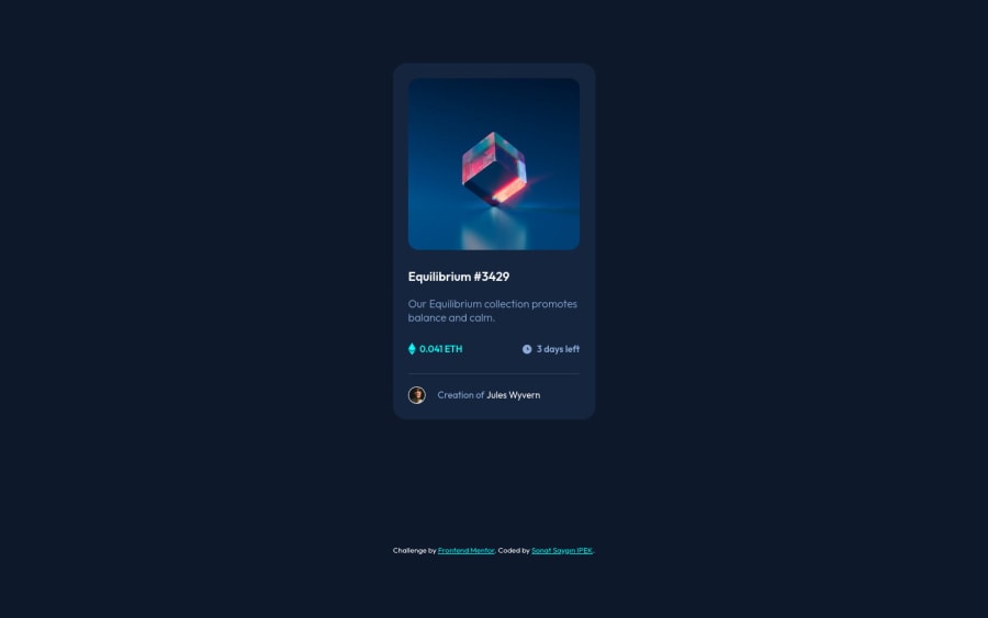
Design comparison
Solution retrospective
Thanks for looking! I'm looking for feedback on my solution. Especially for the card image hover part.
Community feedback
- @PhoenixDev22Posted over 2 years ago
Hello Sonat,
Great work! Congratulation on completing this challenge. I have some suggestions regarding your solution if you don't mind:
- You can use
<main>landmark to wrap the NFT card and<footer>for the attribution. HTML5 landmark elements are used to improve navigation.
- Since there's a :hover state on the image and means it's interactive, So there should be an interactive element around it. When you create a component that could be interacted with a user , always remember to include interactive elements like(button, textarea,input, ..) For this imagine what would happen when you click on the image, there are two possible ways:
1: If clicking the image would show a popup where the user can see the full NFT, here you use
<button>.2:If clicking the image would navigate the user to another page to see the NFT, here use
<a>.- Also use
<a>to wrapEquilibrium #3429.
- The link wrapping the equilibrium image (
image-equilibrium) should either haveSr-onlytext, anaria-labelthat indicates where the link navigate the user.
- For any decorative svgs , each svg tag should have
aria-hidden="true"andfocusable=”false”attributes to make all web assistive technologies such as screen reader ignore those svgs in (icon-ethereum, icon-clock).
- You can use unordered list
<ul>to wrapclass="card-info". In each<li>should be<svg>and<p>, then you may use flex properties to align them centrally.
- The avatar's alt should not include the word
imageorphoto. You can use only the creator's nameJules Wyvern. Read more how to write an alt text .
- To use more semantic tags , you may use
<figure>and<figcaption>for the avatar's part.
- Adding
rel="noopener"orrel="noreferrer"totarget="_blank"links. When you link to a page on another site usingtarget=”_blank”attribute , you can expose your site to performance and security issues.
- There are so many ways to add the hover effect on the image , The one I would use, using pseudo-elements to change the teal bg color to a hsla. Then opacity can be changed from 0 to 1 on the pseudo element on hover. There is no need for an extra clutter in the HTML. You can have a look at my solution here, it might help.
Aside these , your code is clean and well-structured. Hopefully this feedback helps.
Marked as helpful1@sonatipekPosted over 2 years ago@PhoenixDev22 Thank you so much. I'm glad for your feedback, It helped me a lot. I will pay attention to your recommendations.
1@PhoenixDev22Posted over 2 years ago@sonatipek Glad it was helpful. Happy coding!
0 - You can use
Please log in to post a comment
Log in with GitHubJoin our Discord community
Join thousands of Frontend Mentor community members taking the challenges, sharing resources, helping each other, and chatting about all things front-end!
Join our Discord
