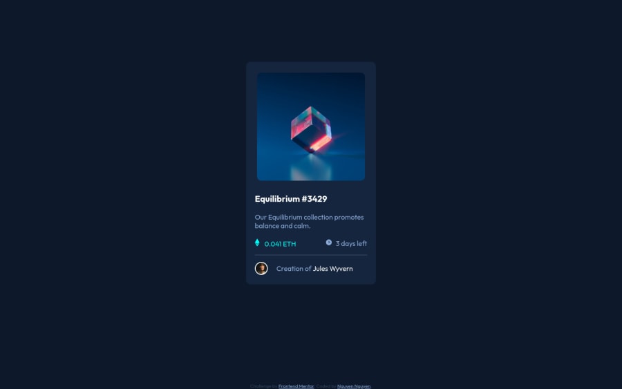
NFT Preview Card Component using CSS Flexbox
Design comparison
Solution retrospective
Any feedbacks are welcome. I have a few issues that I'd love to receive suggestions on:
- At the ethereum icon and days line (below the paragraph), I couldn't center horizontally the words and the icon images. Tried adding padding -bottom and margin-bottom and both didn't work.
- I used fixed height and width for this project but would like to learn how to use rem and em better. Any recommendations on good tutorials for this specific topic?
- Also, I think I'm using a lot of divs in this project, will that be a problem in the future, for more advanced projects?
Community feedback
- @denieldenPosted over 2 years ago
Hi Nguyen, I took some time to look at your solution and you did a great job!
Also I have some tips for improving your code:
- add
main
tag and wrap the card for Accessibility - You can add the effect
:hover
creating adiv
that appears on hover. I used tailwind but you can still see and understand which css properties you can use to do the same. Look here -> my solution - after try to add a little
transition
on the element with hover effect - use Flexbox to the
div
container for center image andspan
like this:
<div class="flex"> <img src="images/icon-ethereum.svg" alt="ethereum icon image"> <p class="eth-quantity"> 0.041 ETH</p> </div>
- guide for relative units of measurement -> read here
Overall you did well :)
Hope this help and happy coding!
Marked as helpful1@jesuisbienbienPosted over 2 years ago@denielden thank you! I'd really appreciate your feedbacks and suggestions.
1 - add
- @Md-Raihan-AlamPosted over 2 years ago
1-> You can use flex or grid for horizontally aligning anything. You can see freecodecamp tutorial = https://www.youtube.com/watch?v=tXIhdp5R7sc for flex box and kevin powell grid =https://www.youtube.com/watch?v=rg7Fvvl3taU. This should cover everything. You should subscribe kevin powell channel, he is consider as king of css by most of developer online. Here is channel=kevin powell, His channel is about everything of css.
2-> Kevin powell has also cover about rem and em. Here is the video=https://www.youtube.com/watch?v=_-aDOAMmDHI and another=https://www.youtube.com/watch?v=N5wpD9Ov_To
3-> No, I have been completing many projects and I also rely on div ( in my opinion). But you should not use unnecessary div
I hope they answered your questions
Marked as helpful1@jesuisbienbienPosted over 2 years ago@Md-Raihan-Alam thank you so much for taking your time to reply to all my questions. They are very helpful. <3
0 - @GitHub-dev12345Posted over 2 years ago
Congratulation Nice Work Keep it up ππ
Used this code want your card in center position :
in body tag Used this CSS Code: body{ display : flex; justify-content: center; align-item: center; }
in Card Design CSS Code used this property: align-self: center;
used this CSS Property in your card to increase and decrease the size of card:
1.In Card design CSS Code Used this:
transform : scale(0.8); this property decrease the size of card. π
large size for increase the number of scale & small size for decrease the number of scale
Marked as helpful0@jesuisbienbienPosted over 2 years ago@GitHub-dev12345 Thank you! I'd appreciate it.
0 - @optimusprime202Posted over 2 years ago
Hey @jesuisbienbien, Now This is what I call a fine job.
0
Please log in to post a comment
Log in with GitHubJoin our Discord community
Join thousands of Frontend Mentor community members taking the challenges, sharing resources, helping each other, and chatting about all things front-end!
Join our Discord