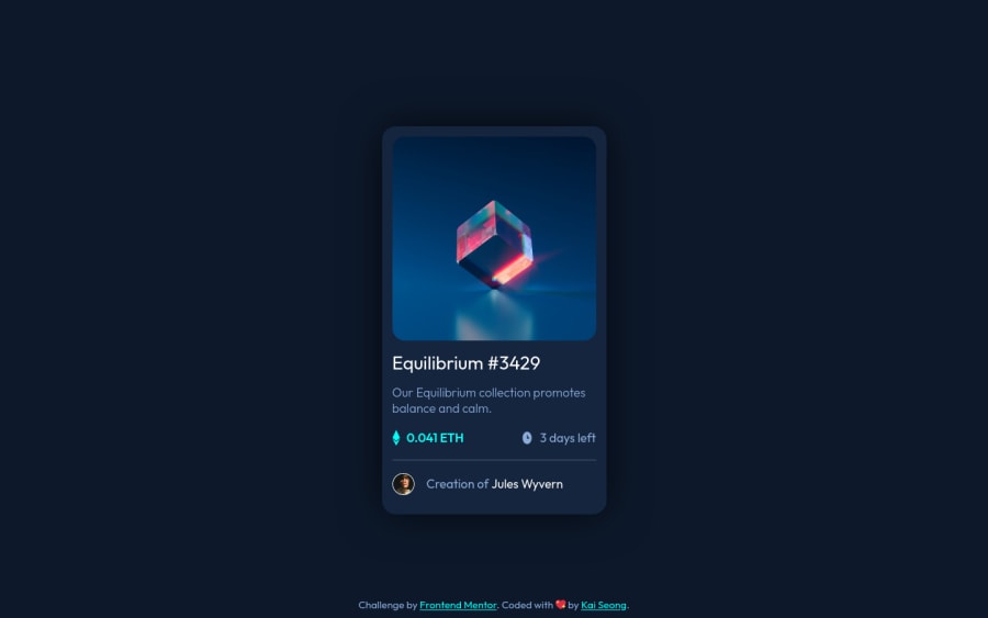
Design comparison
Solution retrospective
I had a little trouble getting the hover effect for the image to work, gotta read up more on pseudo-elements! Feel free to leave any feedback, thanks and cheers!
Community feedback
- @MohamedAridahPosted over 2 years ago
Hello @RowenTey, you did a good job here👍👏. ,but i have some notes for you:
-
When you use
transition. Use it for the element itself not the element on:hovereffect on it. ex:- The wrong way
.element:hover{ transition: opacity 200ms linear; } -
The right way
.element { transition: opacity 200ms linear; } -
One pseudo-element can do the hover effect fine weather
::afteror::before. ex:
	.card .img-wrapper::after {
        content: url(./images/icon-view.svg);
        position: absolute;
        background-color: /* Cyan color here... */;
        width: 100%;
        height: 100%;
        opacity: 0;
        top: 0;
        left: 0;
        display: flex;
        align-items: center;
        justify-content: center;
        transition: .3s ease;
	}
by using the styles above you can remove
.card .img-wrapper::beforestyles safely.- you can see My solution for this challenge it may be useful for you.!
I hope this wasn't too long for you, hoping also it was useful😍.
Goodbye and have a nice day.
Keep coding🚀
Marked as helpful1 -
Please log in to post a comment
Log in with GitHubJoin our Discord community
Join thousands of Frontend Mentor community members taking the challenges, sharing resources, helping each other, and chatting about all things front-end!
Join our Discord
