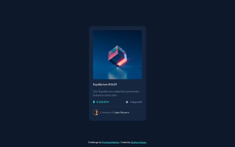
NFT preview card component using CSS Flexbox
Design comparison
Community feedback
- @silkcoderPosted about 1 year ago
Congrats for completing the task.
I noticed one thing, You applied the style
height:100vhto the container element. Its good butmin-height:100vhis more suitable here.To see why, open your site on google chrome, then open developer tools, then click on mobile view, then choose Iphone 12 pro, the site looks good but if you change the orientation, you will see some white colored space at bottom. You can fix this by applying
min-height:100vhinstead ofheight:100vhto the element with class 'contianer'.Good luck with your future tasks.
Marked as helpful1@GustavoSouza123Posted about 1 year ago@silkcoder Thank you for the feedback! I saw the problem on the chrome developer tools and already fixed it.
1
Please log in to post a comment
Log in with GitHubJoin our Discord community
Join thousands of Frontend Mentor community members taking the challenges, sharing resources, helping each other, and chatting about all things front-end!
Join our Discord
