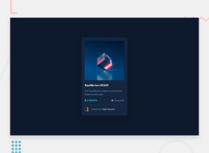
Design comparison
Community feedback
- @VCaramesPosted almost 2 years ago
Hey there! 👋 Here are some suggestions to help improve your code:
- The "NFT image"
alt tagdescription needs to be improved upon ⚠️. Assume that you are describing the image to a someone over the phone.
- The “icons” in this component are purely decorative. ⚠️ Their
alt tagshould be left blank and have anaria-hidden=“true”to hide them from assistive technology.
More Info:📚
https://www.w3.org/WAI/tutorials/images/
- In this component, the "Equilibrium #3429" is a heading ⚠️. So it should be wrapped inside a
headingelement.
- Your
CSS Resetis being underutilized. 😢 To fully maximize 💯 it, you will want to add more to it.
Here are some examples that you can freely use:
- You should never set a
widthto thebodyand you will want to change theheight: 100vh;tomin-height: 100vh;for improved responsiveness.
- For improved accessibility 📈 for your content, it is best practice to use
remfor yourfont-sizeand other property values. Whileemis best formedia-queries. Using these units gives users the ability to scale elements up and down, relative to a set value.
If you have any questions or need further clarification, feel free to reach out to me.
Happy Coding! 🎆🎊🪅
Marked as helpful0 - The "NFT image"
- @pankaj512Posted almost 2 years ago
Thanks for taking your time for this detailed review.
I'm just learning web development, so your feedback is 100% valued to me. Most of the time I get confused about which CSS units to use for what. If possible could you please provide some resources to learning about when to use what CSS units.
You said I should not set width to body, so where I should use provided width for desktop & mobile? On a container?
0
Please log in to post a comment
Log in with GitHubJoin our Discord community
Join thousands of Frontend Mentor community members taking the challenges, sharing resources, helping each other, and chatting about all things front-end!
Join our Discord
