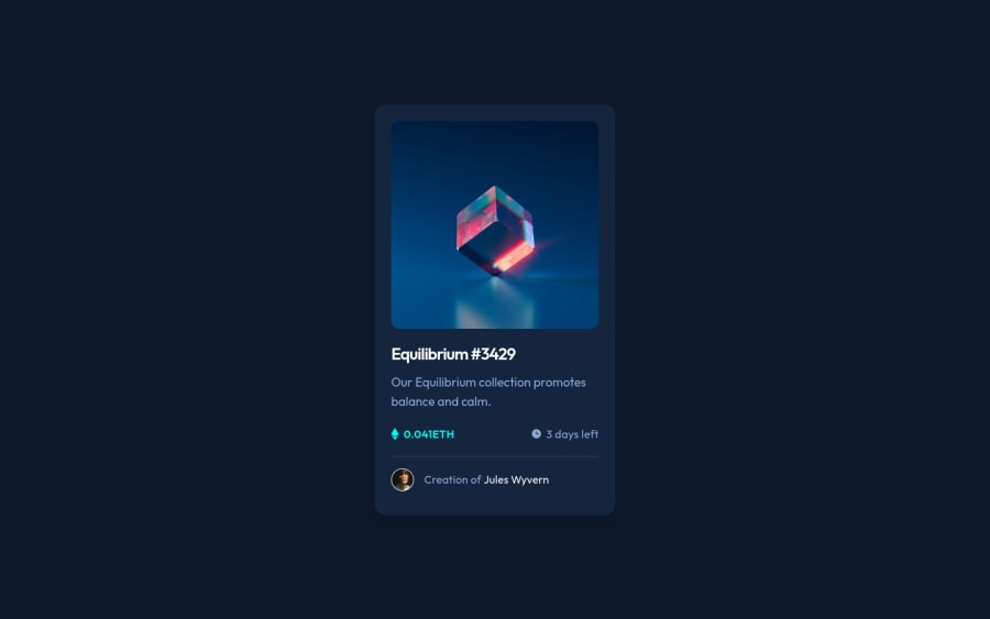
NFT preview card component (Tailwind CSS)
Design comparison
Solution retrospective
Hi there π, Iβm Melvin and this is my solution for this challenge. π
Built With:
- TailwindCSS
- npm - prettier
Any suggestions on how I can improve and reduce unnecessary code are welcome!
Thank you. πβοΈ
Community feedback
- @AbdoAli248Posted almost 2 years ago
Perfect π€©
2@MelvinAguilarPosted almost 2 years ago@AbdoAli248 thank you for the comment !
1 - @Sameermd16Posted almost 2 years ago
Perfect!
2@MelvinAguilarPosted almost 2 years ago@Sameermd16 thank you for the comment !
0 - @MultimarixPosted almost 2 years ago
You've done it again Chief. Pitch perfectππΎ
2@MelvinAguilarPosted almost 2 years ago@Multimarix thank you very much π
1 - @HamzaMasmoudiPosted over 1 year ago
Hello I really like your work and how perfect it is to the design photo I would like to ask you when you use perfect pixel what width and height do you set the image you will follow and what do you use the scale percentage and how much do you usually set it to
0@MelvinAguilarPosted over 1 year ago@HamzaMasmoudi Hello! I usually set the scale percentage to 1 to occupy the entire screen, and I use DevTools for the dimensions. The width is typically 1440px for all images, and the height is determined by the "
desktop-design.jpg
" photo downloaded in the starter files.This photo shows how I use it: screenshot
Hope this helps! Have a great day!
1 - @Ozioma45Posted almost 2 years ago
wow!!! perfecto..Nice one
i am just a newbie i would really appreciate if you look at my solution and give your corrections
0
Please log in to post a comment
Log in with GitHubJoin our Discord community
Join thousands of Frontend Mentor community members taking the challenges, sharing resources, helping each other, and chatting about all things front-end!
Join our Discord