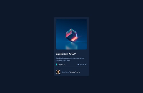
Design comparison
Solution retrospective
I have learned a lot from this project. This is my second solve on the platform and I liked it very much now as to make solve of the challenges which gives the feel of working real world projects. If you find any mistake or want to give any suggestions . Feedback will be appreciated. Thank You !
Community feedback
- @totototoetoPosted almost 3 years ago
Hello, it's a cool work ! I have few suggestions to help you improve your code.
-
Remove
width: 99vw; min-height: 100vh;
and addheight:100vh
in.container
, block elements are always 100% width of their parent width -
Factorize multiples Flex-box patterns like vertical/horizontal center for example by creating a class like this :
.wrapperCenter { display:flex; align-items:center; justify-content:center; }
-
Avoid setting height of a element in your code, height should preferably always depend on the content, not on a predefined value ex
height: 600px;
-
It seems you don't have a mobile first approach. For example, you set the width of your card to 350px at the beginning of your CSS code. When you should do the opposite
-
You can create an element with a responsive width without media query as follows: .responsiveWidth
{ width:87.2%; // (320/375)*100 max-width:350px // normalize width }
Marked as helpful1 -
- @RioCantrePosted almost 3 years ago
Hello there!Nice work with this one. Looking at your solution, I would suggest the following for you...
- Add the hover state of the fonts. In the
.card-title
and.profile p span
includecolor: hsl(178.1, 100%, 50%);
andcursor: pointer;
for the hover state. - Change the color in
.timestamp
intocolor: hsl(178.1, 100%, 50%);
Overall you did good and Keep up the good work!
Marked as helpful1@aayushsingh-459666Posted almost 3 years ago@RioCantre Thanks I haven't noticed that is design thanks for the feedback.
1 - Add the hover state of the fonts. In the
- Account deleted
Hi there 👋
Congratulate on finishing your project 🎉. The design looks beautiful 😃.
I hope these tips help you to improve your design 🚀. Your container height is way too high that is not a good practice because I had to scroll down a bot to see it. And the next thing there is a tiny white space in the right of the container. Follow the steps down to fix it
.container
all in the container selector- let's remove the
height: 150vh
; - Then add
min-height: 100vh
because it can add more space if it needs - To fix that a little white space remove also
width: 99vw
Happy coding ☕
Marked as helpful1@aayushsingh-459666Posted almost 3 years ago@maqsudtolipov Thanks for the feedback.
1 - let's remove the
Please log in to post a comment
Log in with GitHubJoin our Discord community
Join thousands of Frontend Mentor community members taking the challenges, sharing resources, helping each other, and chatting about all things front-end!
Join our Discord