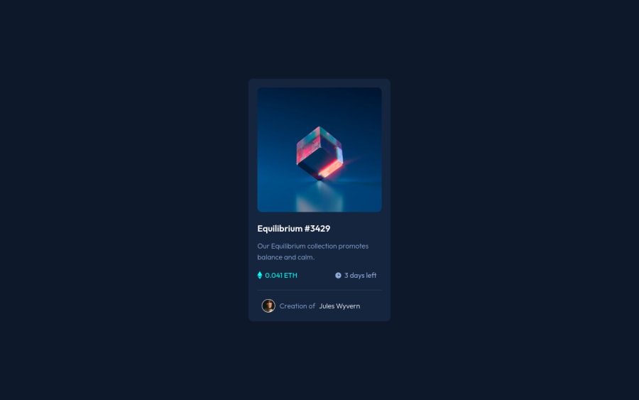
nft preview card component solution with overlay effect
Design comparison
Solution retrospective
my overlay color is not covering whole image , some part if left at the bottom can anyone help with this
Community feedback
- @agnar-nomadPosted about 2 years ago
Hey friend, congrats on your solution.
A few notes: make sure to increase padding a little on the main card (or margin on the elements) considering spacing out elements using flexbox properties instead of manually giving margin values in pixels
To your issue, i would try: remove the right and bottom properties from .overlay give .overlay display:block consider wrapping the image in a container and placing the overlay relative to this container, not relative to the image itself
Marked as helpful1@im-abhijitPosted about 2 years ago@agnar-nomad thanks mate , will make changes as suggested
0 - Account deleted
Hello @im-abhijit,
To fix the overlay color not covering your image add this code:
.overlay{ background-color: hsl(178, 100%, 50%); }- cyan color is given to you in
style-guide.mdfile - Make sure you use
<main>instead of a<div>for accessibility purposes because a<div>isn't that meaningful.
I hope this helps you
1 - cyan color is given to you in
Please log in to post a comment
Log in with GitHubJoin our Discord community
Join thousands of Frontend Mentor community members taking the challenges, sharing resources, helping each other, and chatting about all things front-end!
Join our Discord
