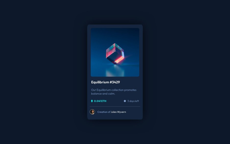
NFT Preview Card Component solution using Flexbox, Grid and Sass
Design comparison
Solution retrospective
It was a good challenge, I did learn quite a few things. From making on hover overlays to grids and flexes. I would like to hear from you for any kind of feedback.
- How is my code looking?
- When to use margin and when padding?
Is using long class names good or bad? I did it here because I can easily nest classes with sass.
Community feedback
- @0xabdulkhaliqPosted over 1 year ago
Hello there π. Congratulations on successfully completing the challenge! π
- I have other recommendations regarding your code that I believe will be of great interest to you.
CSS NAMING CONVENTIONS π«:
- Looks like the naming conventions you used for
css
needs to be improved a lot, you can take a look at BEM Naming Convention. because the naming convention you're currently using is so close to BEM but not actual BEM.
- BEM helps to create modular, reusable, and maintainable code. With BEM, you can easily identify which styles apply to which elements, making it easier to modify and update your CSS.
- BEM naming conventions provide a clear structure and naming hierarchy for your CSS classes. This makes it easier to read and understand your code, even for other developers who are not familiar with your project.
- BEM allows for more granular control over styling. With BEM, you can target specific elements within a block and modify their styles without affecting other elements or blocks on the page.
- BEM helps to avoid naming collisions and specificity issues. By using a consistent naming convention, you can avoid accidentally overwriting styles or causing specificity issues that make it difficult to style your elements.
- BEM makes it easier to collaborate with other developers on larger projects. By using a shared naming convention and structure, you can ensure that everyone on the team is using a consistent approach to styling, which reduces confusion and errors.
- This article on CSS-Tricks provides a beginner-friendly introduction to BEM and explains the key concepts and benefits of using BEM.
.
I hope you find this helpful π Above all, the solution you submitted is great !
Happy coding!
Marked as helpful1 - @grace-snowPosted over 1 year ago
This is pretty good
Really the anchor should be inside the h1. And you need to revisit alt text on images. The clock for example is decorative so should have empty alt; and "avatar" doesn't describe that image.
The styling has some problems though. It's overflowing my screen and there is go space around the component so it doesn't hit screen edges. It's hard to read the minified css though, and I've no time to dig through lots of scss files to unpick why.
You definitely should read this for starters: https://fedmentor.dev/posts/font-size-px/
Marked as helpful1
Please log in to post a comment
Log in with GitHubJoin our Discord community
Join thousands of Frontend Mentor community members taking the challenges, sharing resources, helping each other, and chatting about all things front-end!
Join our Discord