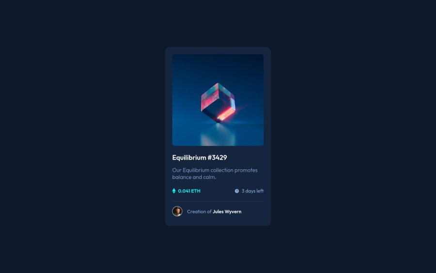
Design comparison
Solution retrospective
I have spent most of the time dealing with responsive design. I used breakpoints to switch from mobile to desktop design, but it complicated style sheet in that challenge. What is the best practices to deal with responsive font sizes, paddings, and margins? What is the best practice to provide spacing between text lines and other elements: margins or paddings? What is the best practice to provide margins around images: fixed or relative units?
Community feedback
- @PhoenixDev22Posted over 2 years ago
Hello rishat-se,
Super work! Congratulation on completing this challenge. I have some suggestions regarding your solution, if you don’t mind:
HTML
- Since there's a :hover state on the image and means it's interactive, So there should be an interactive element around it. When you create a component that could be interacted with a user , always remember to include interactive elements like(button, textarea,input, ..)
for this imagine what would happen when you click on the image, there are two possible ways:
1: If clicking the image would show a popup where the user can see the full NFT, here you use<button>. 2:If clicking the image would navigate the user to another page to see the NFT, here you can use<a>. For the same reason , you can use<a>to wrapEquilibrium #3429andJules Wyvern.
- The link wrapping the equilibrium image should either have
Sr-onlytext, anaria-labeloralttext that says where that link takes you.
- For any decorative images, each img tag should have empty
alt=""and addaria-hidden="true"attribute to make all web assistive technologies such as screen reader ignore those images in(icon-view, icon-ethereum, icon-clock).
- The icon view doesn’t really need to be in the HTML. You can use CSS for it.
- To use more semantic tags , you may use
<figure>and<figcaption>for the avatar's part.
- The alternate text on the avatar image should not be avatar, it’s meaningless. You can use the creator's name
Jules Wyvernfor the avatar image. Read more how to write an alt text
- For the inner part of the card, you can use an unordered list
<ul>, in each<li>there should be<img>and<p>that way you can align them centrally.
- Adding
rel="noopener"orrel="noreferrer"totarget="_blank"links. When you link to a page on another site using target=”_blank” attribute , you can expose your site to performance and security issues.
There are so many ways to do the hover effect on the image, The one I would use is pseudo elements
::before, ::after. You can use pseudo-elements to change the teal background color to hsla. Then the opacity can be changed from 0 to 1 on the pseudo element on the hover. Also using pseudo elements makes your HTML more cleaner as there's need for extra clutter in the HTML .Overall, well done! Hopefully this feedback helps.
Marked as helpful1@rishat-sePosted over 2 years agoHello PhoenixDev22,
Thank you! It was really helpful! It is like info from the next level of HTML and CSS. Now I understand how much I still need to learn about semantics and CSS.
1@PhoenixDev22Posted over 2 years ago@rishat-se You’re welcome and glad to help. Happy coding!
0 - Since there's a :hover state on the image and means it's interactive, So there should be an interactive element around it. When you create a component that could be interacted with a user , always remember to include interactive elements like(button, textarea,input, ..)
for this imagine what would happen when you click on the image, there are two possible ways:
Please log in to post a comment
Log in with GitHubJoin our Discord community
Join thousands of Frontend Mentor community members taking the challenges, sharing resources, helping each other, and chatting about all things front-end!
Join our Discord
