Submitted almost 2 years ago
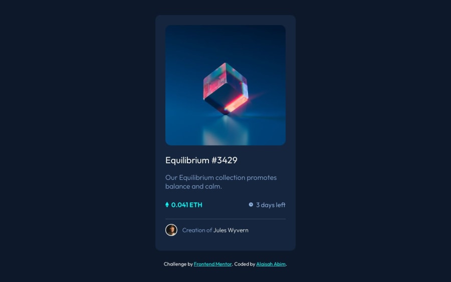
NFT Preview Card Component Solution Using Flex
#accessibility#bem#sass/scss#fresh
@Abimimbom
Design comparison
SolutionDesign
Solution retrospective
I learned a lot in this one for sure. One thing I didn't really get which i'm going to research is why my align items didn't work even though I used it on my main-container but worked when I used it on my body. I'm still figuring out how to use flex and these exercises have been helping me a lot. I also learned how to add the image hover effect because I had no idea how to but thanks to an example from W3S I was able to add this final effect.
If you can please check out my code, leave a review on how I can improve it. Thank you.
Community feedback
Please log in to post a comment
Log in with GitHubJoin our Discord community
Join thousands of Frontend Mentor community members taking the challenges, sharing resources, helping each other, and chatting about all things front-end!
Join our Discord
