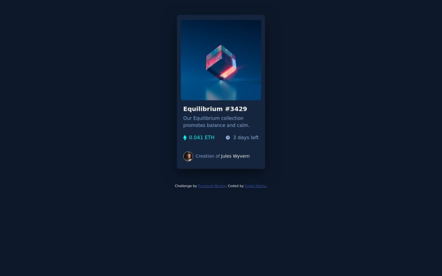
Design comparison
SolutionDesign
Solution retrospective
Take a look of my solution. Feedback is welcomed :)
Community feedback
- @Philip-DroubiPosted almost 2 years ago
Congratulation on completing this challenge.
This is a small tip you can do to improve your solution.
For the page
bodyjust add this.background-color: hsl(217, 54%, 11%); min-height: 100vh; display: flex; align-items: center; justify-content: center; flex-direction: column;That will center page elements for all screens.
Hope this helps you :)
Marked as helpful0
Please log in to post a comment
Log in with GitHubJoin our Discord community
Join thousands of Frontend Mentor community members taking the challenges, sharing resources, helping each other, and chatting about all things front-end!
Join our Discord
