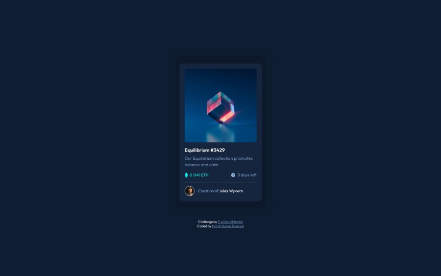
NFT Preview Card Component Solution (HTML + CSS)
Design comparison
Solution retrospective
I am proud that I was able to create the design quite closer to the given original design. From next time, I would try to complete projects in lesser amounts of time and would prefer to start searching out on Google or ChatGPT instead of wasting time too much on problems that require a certain knowledge which I am unaware of, after a certain amount of time.
What challenges did you encounter, and how did you overcome them?Specifically, I encountered following challenges:-
1.Setting up the hover effect on the NFT image.
2.Setting up the background of the card.
I was able to resolve above challenges by spending some time with them and trying out possibilities, which will function better.
In software engineering, patience is a very important skill.
What specific areas of your project would you like help with?I would love to know following:-
1.In general, any improvements or better methodologies I should prefer?
2.Any other approach of setting up the hover effect on the NFT image?
3.Is the background of the card similar to the given design?
Feedbacks are welcome ! Stay Happy & Healthy ! Thanks ! Happy Coding !
Community feedback
Please log in to post a comment
Log in with GitHubJoin our Discord community
Join thousands of Frontend Mentor community members taking the challenges, sharing resources, helping each other, and chatting about all things front-end!
Join our Discord
