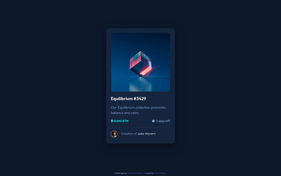
Design comparison
Solution retrospective
Wasn't quite sure if my design was on point, I can definitely see how having access to design files might be beneficial, and as projects get more complex, will upgrade. As I'm still learning, any feedback regarding responsiveness, accessibility, best practices, is very much welcome.
Community feedback
- @denieldenPosted about 2 years ago
Hello Zarko, You have done a good work! 😁
Some little tips to improve your code:
- also you can use
article
tag instead of a simplediv
to the container card for improve the Accessibility - remove all
margin
from.container
class - use flexbox to the body to center the card. Read here -> best flex guide
- after, add
min-height: 100vh
to body because Flexbox aligns child items to the size of the parent container
Keep learning how to code with your amazing solutions to challenges.
Hope this help 😉 and Happy coding!
0@zp021Posted about 2 years ago@denielden Thank you for the response. That makes prefect sense, I used flexbox in the body to center the card in the last challenge, the product preview card, I don't know why I put margins this time. Thanks for the flex guide, that helps.
1 - also you can use
Please log in to post a comment
Log in with GitHubJoin our Discord community
Join thousands of Frontend Mentor community members taking the challenges, sharing resources, helping each other, and chatting about all things front-end!
Join our Discord