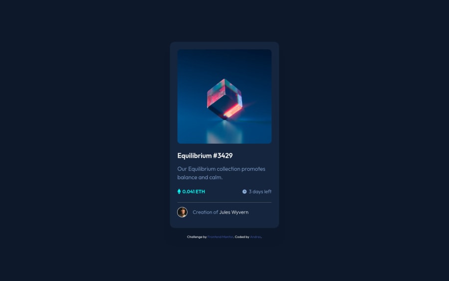
Design comparison
Community feedback
- @VCaramesPosted over 2 years ago
Hey @XJuanRocksX, some suggestions to improve you code:
-
Stay away from IDs when naming your content. They are not reusable and are mainly used for JavaScript. Its best practice to use, Classes for your naming convention as classes are reusable, making them ideal for CSS styling.
-
To give you HTML code structure, you want to set up your code in the following manner (only did parent containers):
   <body>
        <main>
          <article></article>
        </main>
      </body>
The Main Element identifies the main content of the document.
While the Article Element will serve as the card’s container, because the card represents a complete, or self-contained, section of content that is, in principle, independently reusable.
More info:
https://web.dev/learn/html/headings-and-sections/
-
The only article element needed is the one wrapping the card, a simple Div will do for the other parts.
-
Wrap the "NFT image", "Equilibrium #3429" and "Jules Wyvern" in an Anchor Tags <a>. The anchor tag will allow users to click on content and have them directed to another part of your site.
Happy Coding! 👻🎃
Marked as helpful0 -
Please log in to post a comment
Log in with GitHubJoin our Discord community
Join thousands of Frontend Mentor community members taking the challenges, sharing resources, helping each other, and chatting about all things front-end!
Join our Discord
