Design comparison
SolutionDesign
Solution retrospective
What specific areas of your project would you like help with?
Comments and suggestions always welcome!
Please log in to post a comment
Log in with GitHubCommunity feedback
- P@DrakeHermit
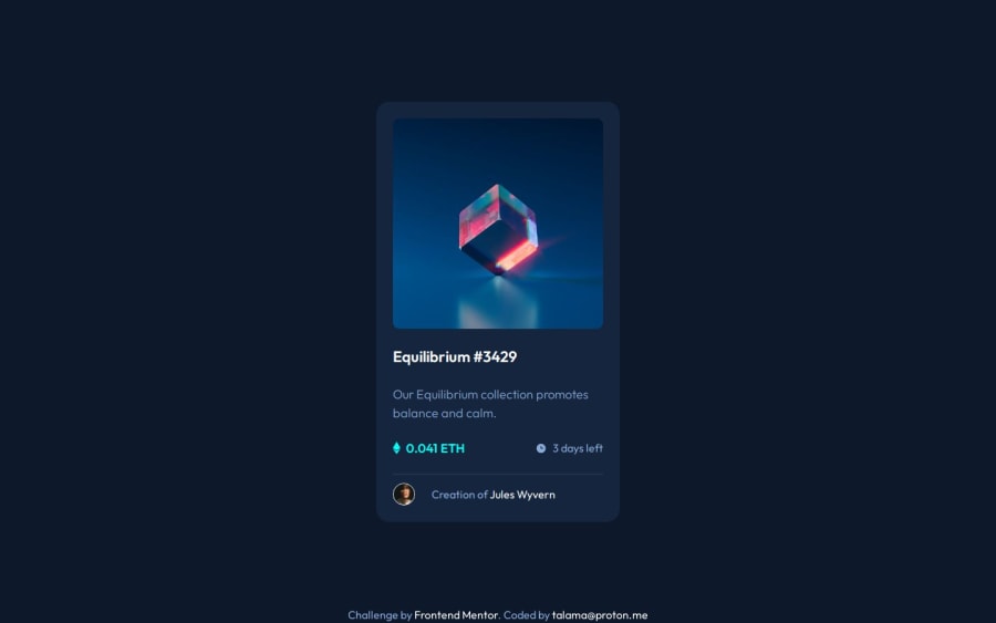
Your solution looks great, other than the fact that the background color isn't spanning across the whole screen. Also maybe the indentation looks off in your HTML markup
Marked as helpful
Join our Discord community
Join thousands of Frontend Mentor community members taking the challenges, sharing resources, helping each other, and chatting about all things front-end!
Join our Discord
