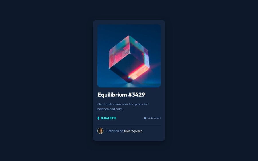
NFT preview card component - SCSS, Flexbox


Design comparison

Solution retrospective
I can see the image when I preview the html locally, and if you hover over the image it shows the hover state. Can anyone help to figure out why the img is not showing?
If you check my code, the figure has the image as the background in the css.
Community feedback
- @VenusYPosted about 1 year ago
Great work on this challenge! You did a good job at recreating the layout of this page.
I noticed that when you decrease the height of the viewport to the point where the card doesn't fit on the page anymore, part of it gets cut off.
This is due to the
heightproperty of the body element being set to100vh. This doesn't allow the height of the body element to expand if the content's height exceeds that of the viewport.You can fix this by removing
height: 100vhand changing it tomin-height: 100vh:body { min-height: 100vh; }I would also recommend you add some padding to the body element because whitespace on a webpage makes for a better user experience.
It adds visual balance and increases readability, so it's quite important even if not strictly necessary.
body {
  padding: 50px
  box-sizing: border-box;
}
If you decide to implement this, you may set the size of the padding to whatever value you see fit. I only used 50px as an example.
The
box-sizingproperty is there to make it so that padding and border size are both included in the calculation for the body's width and height.Without it, the page scrolls even if there is enough space to fit the entire card + padding.
I also noticed that, if you decrease the viewport's width, there comes a point where part of the card will get cut off horizontally, resulting in the user not being able to read certain parts of the card.
This is happening because you've hard-coded the width of the figure element as shown here:
main figure {
  width: 24rem
}
To fix this issue, you could do this:
main {
  max-width: min-content; ❌
  max-width: 350px;
}

main figure {
  width: 24rem; ❌
  height: 24px; ❌
  width: 100%
  aspect-ratio: 1/1;
}
Instead of
max-width: min-content, you should set it to the width of the card in the design mockups. That way, the card won't expand beyond what's necessary.This allows your website to be responsive and enables the card to shrink and expand according to changes in the viewport size.
width: 100%allows the image to always take up 100% of the vertical space within the card.aspect-ratio: 1/1makes sure that the aspect ratio of the figure element always maintains a square shape by automatically adjusting the height.Lastly, the image currently does not show up, and looking in the developer tools shows that it's having trouble fetching the image.
Check to ensure that the image is correctly linked in the
backgroundproperty. If this, doesn't fix the issue, then I'm afraid I'm not sure what might be causing it.Other than that, this is an excellent solution, and well done once again for completing the challenge!
Hope this has been helpful! :)
Marked as helpful0 - P@danielmrz-devPosted about 1 year ago
Hello @FernJBatista!
Your project looks great!
It's quite a challenge to add that hover effect with the overlay image properly. Here's how you can do it:
HTML
<img src="images/image-equilibrium.jpg" alt="Equilibrium" class="pic">
  <div class="icon">
    <img src="images/icon-view.svg" alt="icon-view" class="icon-view">
  </div>
CSS
.pic {
   width: 300px;
   background: url('images/icon-view.svg') center center no-repeat;
   background-color: $Cyan-hover;
   background-size: cover;
   margin: auto;
   border-radius: 10px;
}
.icon {
   display: grid;
   justify-content: center;
   align-items: center;
   position: absolute;
   opacity: 0;
   background-color: $Cyan-hover;
   width: 300px;
   height: 300px;
   border-radius: 10px;
}
icon:hover {
   opacity: .5;
   cursor: pointer;
}
Just don't forget to change the class names to match yours.
I hope it helps!
Other than that, you did an excelent job!
Marked as helpful0


Please log in to post a comment
Log in with GitHub
Join our Discord community
Join thousands of Frontend Mentor community members taking the challenges, sharing resources, helping each other, and chatting about all things front-end!
Join our Discord