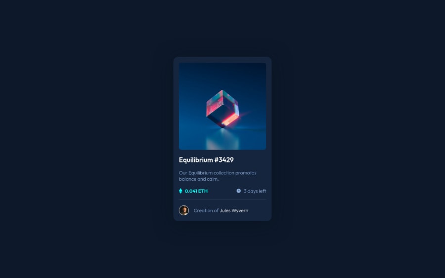
Design comparison
Solution retrospective
Hello there! Is there an efficient way I could've approached this challenge? Particularly on placing the view icon in the center of the image.
Community feedback
- @GabrielMontplaisirPosted almost 2 years ago
Hey Pewpewhamster! Nice design!
Few observations from your code. Take this as you please as I've only tackled this challenge a few days ago myself.
-
You don't need an
alt
text for theicon-view.svg
. Seems redundant to describe it and screen readers would detect it... -
Your approach to creating the overlay is more traditional. I suspect it would work better on older browsers, but is occasionally hard to follow as you're referencing four classes (
image
,hero-image
,overlay
&icon-view
) MULTIPLE times in your CSS. Here's what I did differently (I will use your CSS class names as reference) Notice how it only uses two classes instead:
.image { position: relative; margin: 1.6rem; border-radius: .5rem; overflow: hidden; } .overlay { position: absolute; display: flex; justify-content: center; align-items: center; object-fit: none; width: 100%; height: 100%; background-color: hsla(178, 100%, 50%, 0.5); opacity: 0; } .overlay:hover { cursor: pointer; opacity: 1; transition: opacity 0.25s ease; }
And the HTML:
<div class="image"> <img class="overlay" src="./images/icon-view.svg" alt="" /> <img src="./images/image-equilibrium.jpg" alt="Picture of Equilibrium NFT" /> </div>
I used
flexbox
to move the icon to the middle of the image where I wanted, expanded it towidth:100%; height:100%;
to span the whole image container, gave it the background color. Theobject-fit:none
makes the icon retain it's initial dimensions instead of scaling up because of the width/height I provided.Marked as helpful1@gian-nochePosted almost 2 years ago@GabrielMontplaisir Thanks a lot for your feedback.
- The alt attribute for the view icon was an alert given by the accessibility report of frontendmentor. But I didn't know you can just leave it blank until I checked your code so thank you for that tip 😆
- As for the multiple classes, I did want to just change the background color of the view icon but I wasn't sure how to apply the full width and height to the background without resizing the icon so I ended up using the long road 😂 Object-fit is something I'll have in mind in the future now when dealing with images.
Quick question, I noticed in your CSS that there's some kind of boilerplate to "reset" it. Is it best practice to just copy/paste that on every CSS? Just wanted to know if I should start doing that with mine as well in the future.
Overall, thank you again for the feedback, really appreciate it 👍
0@GabrielMontplaisirPosted almost 2 years ago@gian-noche
The boilerplate as you call it is referred to as a "CSS reset". It's a great way to reinitiate a new webpage as browsers often use their own "defaults" (for example, a browser will have pre-determined margins on their headers, paragraphs, body, etc.). These defaults can mess with your design in the long run. Every time I tackle a new challenge or a new project, I copy-paste my CSS reset into my stylesheet to "start fresh".
You can read up on it here:
- https://meyerweb.com/eric/tools/css/reset/ (outdated but still helpful read)
- https://www.joshwcomeau.com/css/custom-css-reset/ (Mine is based on this one).
0 -
Please log in to post a comment
Log in with GitHubJoin our Discord community
Join thousands of Frontend Mentor community members taking the challenges, sharing resources, helping each other, and chatting about all things front-end!
Join our Discord