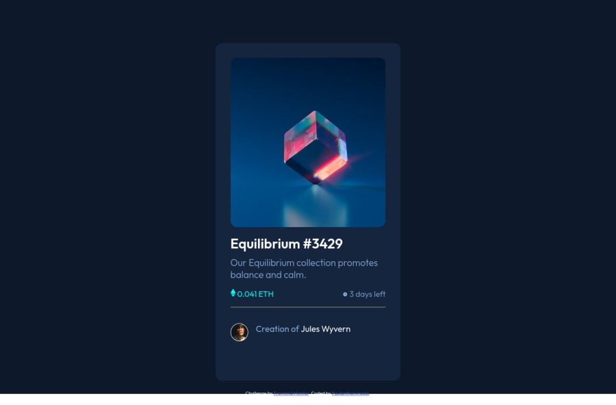
Design comparison
SolutionDesign
Community feedback
- @denieldenPosted over 2 years ago
Hey Paul, congratulations on completing the challenge! You did a great job 😉
Let me give you some little tips for optimizing your code:
- set
background: hsl(217, 54%, 11%)to body - add
maintag and wrap the card for improve the Accessibility - use
imgelement for the image and not styleddiv - to make it look as close to the design as possible add
width: 20remto.main-wrapperclass and remove allpadding - You can add the effect
:hovercreating adivthat appears on hover. I used tailwind but you can still see and understand which css properties you can use to do the same. Look here -> my solution - use
ptag instead ofh4for the text of card - using
<hr>for the line is not the best way because this tag have a semantic meaning... in this case use div withborder-bottombecause this line is decorative - use flexbox to the body to center the card. Read here -> best flex guide
- after, add
min-height: 100vhto body because Flexbox aligns child items to the size of the parent container - instead of using
px or %use relative units of measurement likerem-> read here
Hope this help! Happy coding 😁
Marked as helpful0 - set
Please log in to post a comment
Log in with GitHubJoin our Discord community
Join thousands of Frontend Mentor community members taking the challenges, sharing resources, helping each other, and chatting about all things front-end!
Join our Discord
