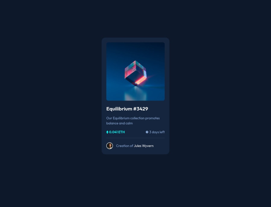
Design comparison
Solution retrospective
I finally solved this challenge in two days. I'm gonna say this was a very tricky one at least for me as a CodeNewbie. But on the other hand it was fun to work on this challenge sind I learned a couple of things too. In the beginning I was fired up how fast I was by building the mark-up and styling the whole thing but guys the active state really frigging got me =D=D=D
It took me twice as long if not three times longer to solve the hover state issue than simply building the page.
But now I have it set and done and it's time to present it to you. As Always please leave a like or comment and don't hold yourself back if you have any valuable advice for me that brings me further on my coding journey. Appreciate it a lot.
Best regards, Aki aka AkraDEV
Community feedback
- @GlozsaPosted over 2 years ago
Hello there @TayAki79!
Just a quick observation, the overlay image when you hover the NFT should have a border-radius. and your <HTML> should have lang="en" inside of it.
Hope you find this helpful, happy codding and holidays :D
Marked as helpful1@TayAki79Posted over 2 years ago@Glozsa hi there 🙌
Yeah, I‘ll work this out. Thx, much appreciation 🙏🏽
1@TayAki79Posted over 2 years ago@Glozsa hi, alright. I fixed the border-radius issue. But I don't know what you mean I should have lang=en inside the html tag? It's already in there ('wondering!!!'). Can you please make a screenshot that it's not inserted? That would be nice! : - )
Best regards, AkraDEV
1@GlozsaPosted over 2 years ago@TayAki79 sorry, got confused. I meant that instead of the H2 you have there, an h1 would be more appropriate. Sorry haha :D
1@TayAki79Posted over 2 years ago@Glozsa ah alright! haha, but can you see the lang="en" value?
0 - @xyzeezPosted over 2 years ago
Hello @TayAki79, Nice work I really most say but there are few patches to make.
-
Your
<body>should not have a height or width, this way it would maintain the device width. You could see that it stretches out when viewed with different device. -
You're having the
<header>used wrongly. In this challenge you do not need a header. The header tag is used to contain links for navigation between pages. See here for more on the header tag. -
Use the
<main>tag to contain all the card element. remove the header and use a<div>as replacement. In that<div>, have a<picture>to house the<img>.
Happy coding :)
Marked as helpful1@TayAki79Posted over 2 years ago@xyzeez hi. Appreciate your feedback a lot. I‘m at work right now but can’t wait to apply what you recommend ☺️🙏🏽
0@TayAki79Posted over 2 years ago@xyzeez Alright. I'm back home now. I changed the header-tag to a div-element as you say. The reason I put the hero-img in the css-file was because I didn't find any way how to keep it in the html-file and still can put the overlay on it. That's why I said it took me more time to style the hover state than actually building the page. But what I wanna try is to change the regarding elements into clickable elements. That was recommended by Grace on slack in the Frontend Mentor Channel.
Concerning the measurements in the body-element I just read an interesting article by Dave Gray of freeCodeCamp where he talks about best practice of applying width and height to a webpage. You can read it here.
What's your opinion on this?
Best regards, AkraDEV
0@xyzeezPosted over 2 years ago@TayAki79 As regards the hover state of the image, you in the container that has the image, you can have another empty div below it like this:
<div class="container">
 <picture> //Here you have the image// </picture>
 <div> //Here is the empty div for the hover state// </div>
</div>
With this, you can use CSS to make the empty div cover the image by setting its position, width and height. See How
As regards the body height, I'm talking in respect to this challenge and the approach you've taking. We all learn in this process. Thank you!
1@TayAki79Posted over 2 years ago@xyzeez Oh you mean, I can stack the img and overlay on one another. OK. I didn't new that "picture" is also an html element =D ! I will try this on my next challenge since my solution is still working well for now. But you got it right. There's so many ways to catch up on the same target and I'm still far from being a good and clean coder. That's why I appreciate all of your feedback so much and do my best to become a real pro in this game. So thank you and all of the others here.
If y'all want to, please hit me up on twitter, linkedIn etc.
Peace, Love and Code
1 -
Please log in to post a comment
Log in with GitHubJoin our Discord community
Join thousands of Frontend Mentor community members taking the challenges, sharing resources, helping each other, and chatting about all things front-end!
Join our Discord
