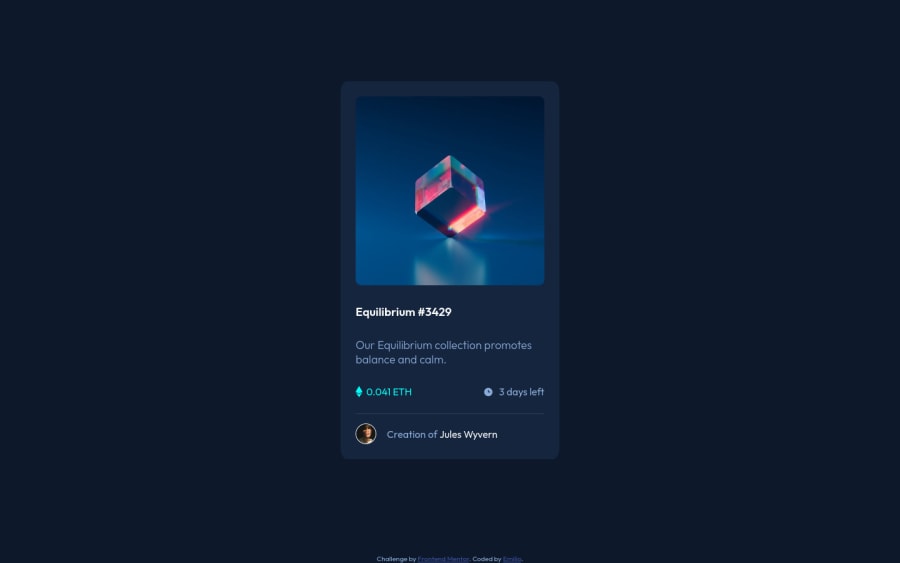
Design comparison
Solution retrospective
I have used mainly px for paddings, margins, widths and heights. Is that ok, or should I use %?
Community feedback
- P@brodiewebdtPosted about 3 years ago
I would start using Ems, and Rems. Pixels aren't responsive. Check out Kevin Powell for any CSS info. He is the best. Your card looks good. Practice by changing the fonts to Rems and the padding and margins to Ems. Try not to use specific heights. Use the content and any spacing to create the height of the design.
Add ALT text to the images. You can leave it empty as the images are only decoration, but they should have ALT text for accessibility reasons. Change the Equilibrium text to an H1. You may have to restyle the H1 tag to look the same as before. Every page should have an H1. Wrap your card div in a Main tag and change the attribution div to a Footer and it will clear the accessibility warnings.
Download AXE DevTools and you can clear accessibility warnings while you code. https://www.deque.com/axe/devtools/
Hope this helps.
Marked as helpful0@E1000oPosted about 3 years ago@brodiewebdt Thanks, David! Super helpful, I'll work on it.
1
Please log in to post a comment
Log in with GitHubJoin our Discord community
Join thousands of Frontend Mentor community members taking the challenges, sharing resources, helping each other, and chatting about all things front-end!
Join our Discord
