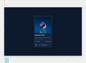
Design comparison
Community feedback
- @VCaramesPosted almost 2 years ago
Hey there! 👋 Here are some suggestions to help improve your code:
- The NFT
alt tagdescription needs to be improved upon. You want to describe what the image is; they need to be readable. Assume you’re describing the image to someone.
More Info:📚
https://www.w3.org/WAI/tutorials/images/
- The “Icons” serve no other purpose than to be decorative; They add no value. Their
alt tagshould left blank and have anaria-hidden=“true”to hides it from assistive technology.
More Info:📚
https://www.w3.org/WAI/tutorials/images/
- Wrap the "NFT image" in an
anchor tags. The anchor tag will allow users to click on content and have them directed to another part of your site.
More Info:📚
- The
attributionshould be wrapped in afooterelement.
If you have any questions or need further clarification, feel free to reach out to me.
Happy Coding!🎄🎁
Marked as helpful0 - The NFT
- @chrizgxPosted almost 2 years ago
Hey! I really like your design. I also took a look at your code, and I was amazed by how it's possible to edit opacity through HSL colors directly. When I wanted to apply opacity to the color itself (instead of the whole element), I had to to find the equovalent RGBA code. Thanks for that!
As for feedback, the only thing I can say is you forgot to add border-radius: 10px to the overlay.
I really like the outcome, great work!
Marked as helpful0@midnight-clrkPosted almost 2 years ago@chrizgx Hey, thanks for the feedback. I learned it from Kevin Powell, amazing CSS teacher.
0
Please log in to post a comment
Log in with GitHubJoin our Discord community
Join thousands of Frontend Mentor community members taking the challenges, sharing resources, helping each other, and chatting about all things front-end!
Join our Discord
