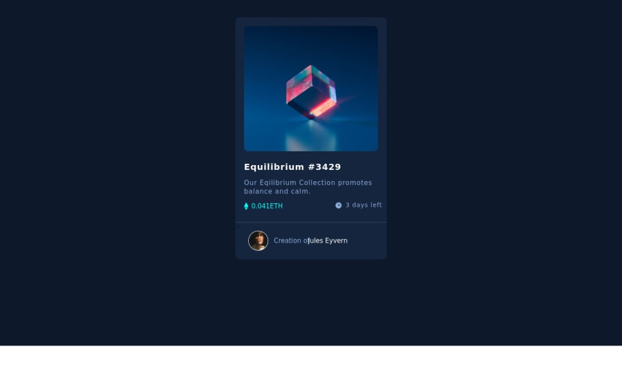
Design comparison
SolutionDesign
Community feedback
- @rsrclabPosted almost 3 years ago
Hi, @Adrozipp ~
Congratulate on your solution to the challenge on FM platform. I have studied your work carefully and learned a lot from it.
Here are some of the tips I like to provide.
- On smaller devices, body element goes over screen, and I think
max-width: 100%can solve this issue. And wider devices, body element has white space around the border. - Please try BEM for naming element classes. It will help you a lot on bigger projects.
- There is no hover effects on image and other elements. It's also one of challenging part here.
https://www.frontendmentor.io/solutions/my-first-solution-on-chanllenge-V-4IzAivH
Here is my solution to this challenge, and if it can help you even a bit, it would be happy to me.
Cheers ~
1 - On smaller devices, body element goes over screen, and I think
Please log in to post a comment
Log in with GitHubJoin our Discord community
Join thousands of Frontend Mentor community members taking the challenges, sharing resources, helping each other, and chatting about all things front-end!
Join our Discord
