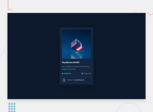
Design comparison
Solution retrospective
Any feedback will be appreciated! Thanks
Please log in to post a comment
Log in with GitHubCommunity feedback
- @Ahmed-Elbald
Hello Asma,
Generally, I think you've done a great job. Your solution looks good and close to the original design. However, I've some subtle notes that you might find helpful:
-
Your solution lacks some features when it comes to accessibility. You should wrap the whole card in an
articleelement as it seems like a standalone element (it gives meaning on its own). When presenting the price and the days left, you can use adlelement whereas hiding the terms using a.visually-hiddenclass, so that it makes sense for disabled users. It should be something like that:<dl> <dt class='visually-hidden'>Product price</dt> <dd>0.041ETH</dd> <dt class='visually-hidden'>days left</dt> <dd>3 days left</dd> </dl>You can find more about the
dlelement here. You can also read about the.visually-hiddenclass here -
This is not important, but you should add some padding to the top and bottom of the page. It would also be great if you made effects (on hover state) have some duration using the
transition-durationproperty
Marked as helpful -
Join our Discord community
Join thousands of Frontend Mentor community members taking the challenges, sharing resources, helping each other, and chatting about all things front-end!
Join our Discord
