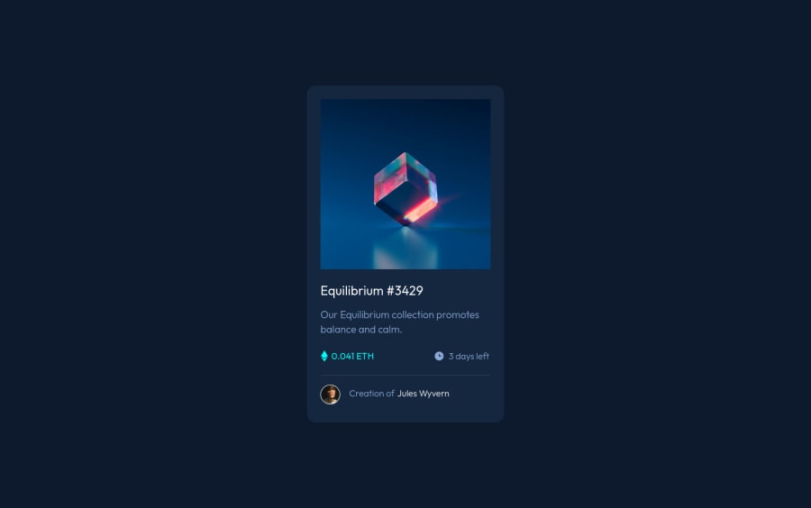
Design comparison
Community feedback
- @correlucasPosted over 2 years ago
👾Hello @Giorgi-Bebia, Congratulations on completing this challenge!
I’ve few suggestions for you that you can consider adding to your code:
1.Add transitions to make the interaction smoother while the element gets hovered, you can use a value like
transition: all ease-in 0.5s.2.Add
<main>instead of<div>to wrap the card container. This way you show that this is the main block of content and also replace the div with a semantic tag.3.Use relative units like
rem or eminstead ofpxto have a better performance when your page content resizes on different screens and devices.REMandEMdoes not just apply to font size, but all sizes as well. To save your time you can code your whole page usingpxand then in the end use a VsCode plugin calledpx to remto do the automatic conversion or use this website https://pixelsconverter.com/px-to-rem✌️ I hope this helps you and happy coding!
Marked as helpful0 - @amulyalovescodingPosted over 2 years ago
Hello @Giorgi-Bebia, Congratulations on completing this challenge! I really liked the result of your project, but I have some tips that I like to share:
1- Every page should have one main landmark <main>. So replace the div that wraps the whole content with <main> to improve the accessibility. click here
2- All page content should be contained by landmarks, you can understand better by clicking here: click here
✌️ I hope this helps you.
Marked as helpful0
Please log in to post a comment
Log in with GitHubJoin our Discord community
Join thousands of Frontend Mentor community members taking the challenges, sharing resources, helping each other, and chatting about all things front-end!
Join our Discord
