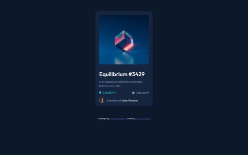
Submitted over 1 year agoA solution to the NFT preview card component challenge
NFT Preview Card Component, My Solution
P
@VincinChristmas

Solution retrospective
What are you most proud of, and what would you do differently next time?
I didn't use grid or flexbox for this, I used floats. I think I properly used float concepts and have properly contained floated elements. I had no difficulties using floats in this project.
What challenges did you encounter, and how did you overcome them?I had a big problem getting my main section centered. Probably because I didn't put a width on it, so it was getting bigger on bigger screens.
What specific areas of your project would you like help with?understanding how to properly apply display: block, margin: 0 auto
Code
Loading...
Please log in to post a comment
Log in with GitHubCommunity feedback
No feedback yet. Be the first to give feedback on Vincin Christmas's solution.
Join our Discord community
Join thousands of Frontend Mentor community members taking the challenges, sharing resources, helping each other, and chatting about all things front-end!
Join our Discord