Design comparison
Solution retrospective
This is my 3rd challenge :)
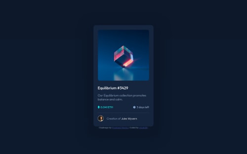
On this one, I had to use "position: absolute" for the eye icon above the cube image. I don't think this is the ideal solution, but I couldn't find another way to have both images superimposed.
Any held, and feedback over the whole project, is welcome! :D
Community feedback
- @PhoenixDev22Posted about 2 years ago
Hello Julien,
Congratulation on completing this challenge. Excellent work! I have few suggestions regarding your solution, if you don't mind:
HTML
- You can use the
<main>
landmark to wrap the NFT. And<footer>
landmark to wrap the attribution, using landmarks is important to improve navigation experience on your site for users of assistive technology.
<a href="#"><h1></h1></a> <h1 ><a href="#"></a></h1>
they don't have the exact same effect. So it depends on what you want to make a hyperlink, in case you surround the entire
<h1>
you need to put it as a parent. In case you want to get only a specific part of the<h1>
you only surround that part like this:<h1 ><a href="#"></a></h1>
.- The link wrapping the equilibrium image should either have
Sr-only
text, anaria-label
oralt
text that says where that link takes you.
- For any decorative images, each img tag should have empty
alt=""
and addaria-hidden="true"
attributes to make all web assistive technologies such as screen reader ignore those images in(icon-view, icon-ethereum, icon-clock ).
- Profile images like that avatar are valuable content. The alternate text of the avatar’s image should not be author-avatar-img. You can use the creator's name
Jules Wyvern
. Read more how to write an alt text
- If you wish to draw a horizontal line, you should do so using appropriate CSS. You may remove the
<hr>
, you can useborder-top:
to the avatar's part.
- There are so many ways to do the hover effect on the image, The one I would use is pseudo elements
::before, ::after
. You can use pseudo-elements to change the teal background color to hsla. Then the opacity can be changed from 0 to 1 on the pseudo element on the hover. Also using pseudo elements makes your HTML more cleaner as there's no need for extra clutter in the HTML.
- Adding
rel="noopener"
orrel="noreferrer"
totarget="_blank"
links. When you link to a page on another site usingtarget=”_blank”
attribute , you can expose your site to performance and security issues.
Aside these, Great job on this one. Hopefully this feedback helps.
Marked as helpful0 - You can use the
- @blazingfringePosted about 2 years ago
You can wrap all your body inside main to get rid of that accessibility issue in the solution report.
0 - @Razha90Posted about 2 years ago
position: absolute;
is best solution for this , but you give set position liketop
orleft
, if you delete set position and give little margin for setting position you got it .- This card not centering , you can add
body {width:100vh; height: 100vh; display:flex; align-items: center; justify-content: center;}
for make card be auto center. you can deletetemargin: auto;
and.content-and-attr
Happy Coding 😆
0@windu80Posted about 2 years ago@Razha90 Thanks for that! I changed the top and left, and use the margin instead, it works :)
For the rest, I haven't learnt Flexbox yet, so I'll come back to that later
0
Please log in to post a comment
Log in with GitHubJoin our Discord community
Join thousands of Frontend Mentor community members taking the challenges, sharing resources, helping each other, and chatting about all things front-end!
Join our Discord