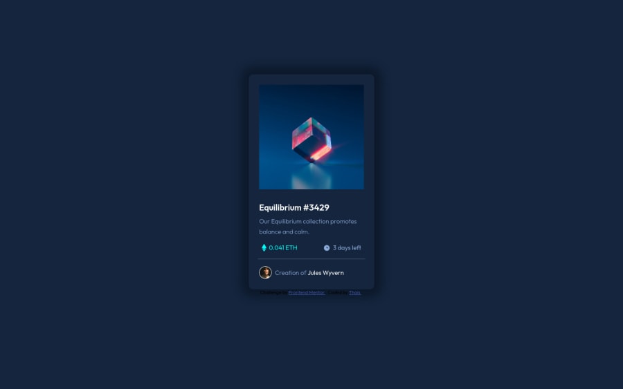


Design comparison
SolutionDesign

Solution retrospective
I appreciate reviews (:
Community feedback
- P@brodiewebdtPosted over 3 years ago
This looks good. The alignment, spacing and hover effect look good. The shadow is a little heavy.
Change the attribution div to a Footer and it will clear the accessibility warning.
Hope this helps.
Marked as helpful0

Please log in to post a comment
Log in with GitHubJoin our Discord community
Join thousands of Frontend Mentor community members taking the challenges, sharing resources, helping each other, and chatting about all things front-end!
Join our Discord