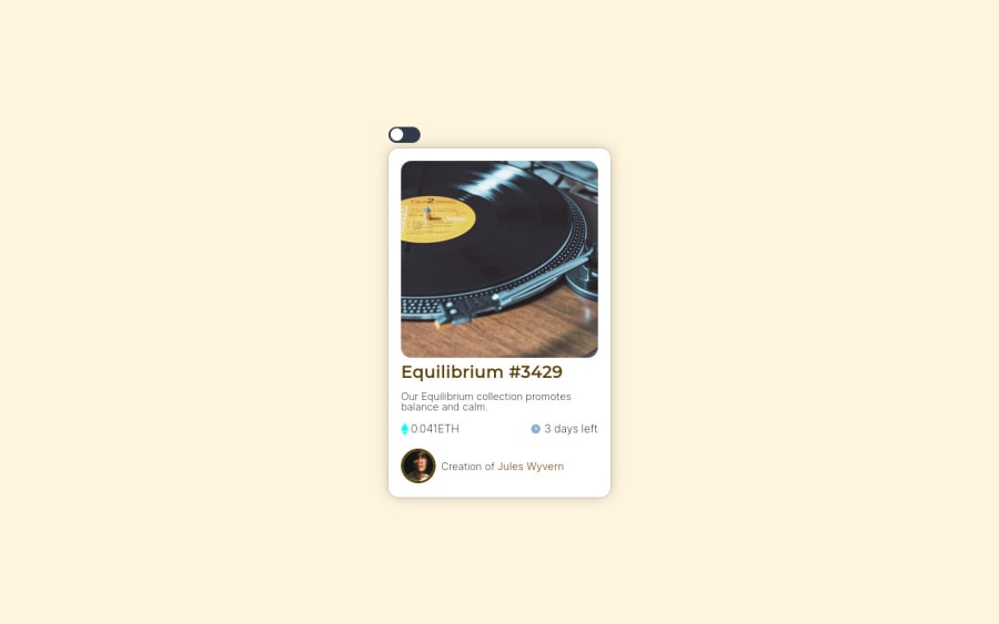
Design comparison
Solution retrospective
In this challenge, I learned practical fundamentals of flexbox, CSS style and fundamentals and intermediate knowledge of Javascript, without using any framework. Another step of fundamental importance is related to the semantics of HTML and Javascript, in order to make the code more readable.
Community feedback
- @visualdennissPosted over 1 year ago
Awesome work by customising the design and adding a theme switch feature! Nice choice of image as well and nice detail of giving a moon shape to the toggle when dark mode.
-
In dark-mode these texts: '0.041ETH 3 days left' seem to be too dark and unreadable, so you might change them into lighter value as well.
-
I personally find the scale up of the image a bit too much, usually a slight increase like up to 1.15 is good enough and subtle. But eventually it is matter of taste ofc :)
Hope you find this feedback helpful!
Marked as helpful0 -
Please log in to post a comment
Log in with GitHubJoin our Discord community
Join thousands of Frontend Mentor community members taking the challenges, sharing resources, helping each other, and chatting about all things front-end!
Join our Discord
