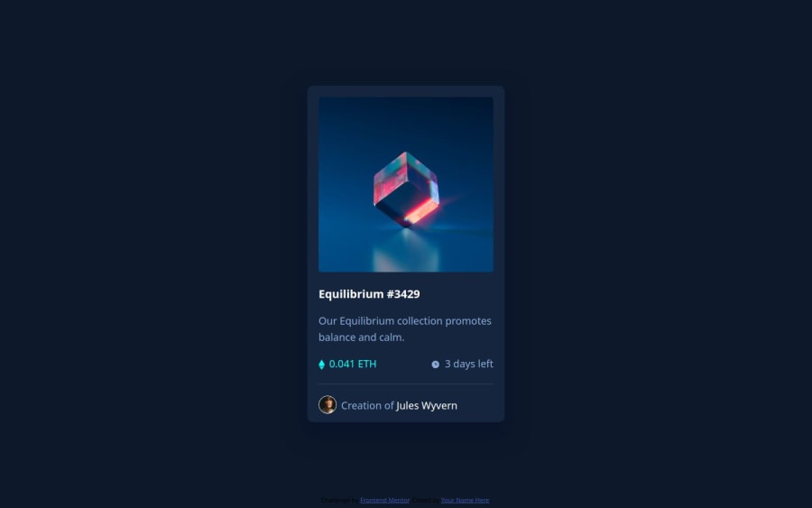


Design comparison

Solution retrospective
I need help with filling the image container with transparent cyan color. I'm open to suggestions.
I'd appreciate any suggestions on how to improve my media queries so I can make this page look better on mobile, because I struggle really bad with them.
I'm still very new to html and css, only 1 month in, so I'll appreciate any advice on how to improve my skills.
Community feedback
- Account deleted
*,
*::after {
  box-sizing: border-box;
  padding: 0;
  margin: 0;
}

body {
  display: grid;
  place-items: center;
  min-height: 100svh;

  background: #1B1D36;
}

.image-container {
  position: relative;
  width: 500px;

  border-radius: 1.5rem;
  overflow: hidden;
}

img {
  display: block;
  width: 100%;
}

.image-container::after {
  position: absolute;
  content: "";
  top: 0;
  left: 0;

  width: 100%;
  height: 100%;

  opacity: 0;
  background: rgba(234, 179, 8, .3);
  z-index: 9;

  transition: opacity .3s linear;
}

.image-container:hover::after {
  opacity: 1;
}
Here's a simple piece of code that will give you the desired effect for the hover on the image.
Marked as helpful1@dpiskovPosted 9 months ago@Benjihunt97 Thanks a lot! I tried it out and it works perfectly, thank you! I still need to take my time with it and try to really understand what's going in the background and understand how the code works.
0Account deleted@dpiskov your welcome, and you can look up each piece of code to understand it better. If you have any questions I'd be more than happy to help you out.
1 - @scotttaborPosted 9 months ago
Hey! For being one month in your design looks pretty great in my opinion. You are ahead of me when I was only at a month. For the cyan color, look up css overlays, this is what I did to achieve the background. I don't want to give you the exact answer right way because as a fellow wannabe developer, having to figure some stuff out for yourself is the best way to learn! If you give css overlays a quick google search you will find out pretty quickly how to do them.
Marked as helpful1@dpiskovPosted 9 months ago@scotttabor Thanks a lot! Yes I totally agree with you that we have to learn to search for what we need, it's just a problem when you have no idea what you are searching for. For example I haven't heard of CSS Overlays so I have no way of knowing what I actually need to achieve what I need at a particular moment. So it's great that we have a community that can give each other a little push or a hint to the direction that we need to go to!
1

Please log in to post a comment
Log in with GitHub
Join our Discord community
Join thousands of Frontend Mentor community members taking the challenges, sharing resources, helping each other, and chatting about all things front-end!
Join our Discord