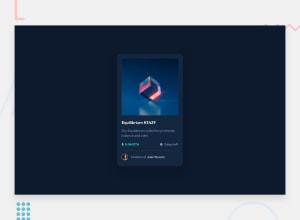
Design comparison
Solution retrospective
Hi there, I'm Yves and this is my solution for this challenge.
This challenge looks simple. yet still challenging! Especially when making it accessible.
A things that I learned in CSS
- text-decoration-skip-ink: auto|all|none
Build with
- HTML
- CSS
Anyway, feel free to give me any suggestions or feedback. Thanks!
Community feedback
- @bammytech1Posted almost 2 years ago
@hozayves Nice work mate. i will suggest you use rem for font sizes and em for padding and the likes.
1 - @CodeWithAlaminPosted almost 2 years ago
Hi Yves MUHOZA👋 Great job on completing this challenge! 🥳
I would like to share a few suggestions on this solution if you don't mind.
HTML
-
Instead of using a
divelement with a class ofether-img-containerto wrap the image and thedivwith a class ofether-img-view, it might be more semantically meaningful to use anaelement to wrap the image and set thedivwith a class ofether-img-viewas a child element. This would allow the entire image to be clickable and provide a visual indication that the image is a link when the user hovers over it. Learn more -
Instead of using a
pelement with a class ofether-creator-nameto wrap the creator's name and a link, it might be more semantically meaningful to use aciteelement to wrap the creator's name and aaelement to wrap the link. This would provide more context to the content and help search engines and screen readers understand the content better. Learn more
CSS
-
Instead of using the
colorproperty to style the text color of different elements, it might be more useful to use thecolorproperty in conjunction with custom color variables defined in the "BASE" section. This would make it easier to maintain the color scheme of the site and avoid the need to change the color of multiple elements separately. Learn more -
Instead of using the
displayproperty to toggle the visibility of theether-img-viewelement, it might be more useful to use theopacityproperty in conjunction with a transition to create a smooth fade in and fade out effect. This would provide a more seamless experience for the user and avoid the need to recalculate the layout of the page when the element is shown or hidden. Learn more -
Instead of using the
border-radiusproperty to round the corners of theether-mainelement, it might be more useful to use theborder-radiusproperty in conjunction with theoverflowproperty to create a "card" effect. This would allow the content inside theether-mainelement to overflow the rounded corners and create a more visually appealing design. Learn more -
Instead of using the
max-widthproperty to set the width of theether-mainelement, it might be more useful to use themax-widthproperty in conjunction with thewidthproperty and a media query to create a responsive layout. This would allow theether-mainelement to adjust its width based on the size of the viewport and provide a better user experience on different devices. [Learn more](https://developer.mozilla.org/en-US/docs/Web/CSS/
Overall, this is a very well done solution to the challenge. Great job!
I hope this feedback was helpful. 😊 Keep up the good work!👍
0 -
Please log in to post a comment
Log in with GitHubJoin our Discord community
Join thousands of Frontend Mentor community members taking the challenges, sharing resources, helping each other, and chatting about all things front-end!
Join our Discord
