Design comparison
Solution retrospective
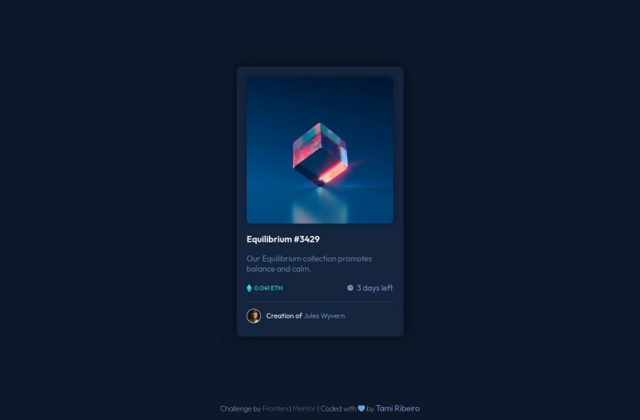
So... my first solution here, hi everyone 🖐🏻. I'm really happy with my results but there's this thing bothering me tho. How can I make my eye icon have a different opacity than its father element? I'm stuck here. Thank u in advance 💙
Community feedback
- @wiridixPosted almost 3 years ago
Hi! you have a very good job. The detail with your hover in the image is that the container .overlay you have to place a transparent color ( hsl(178, 100%, 50%, 60%) ) and the overlay:hover set the opacity to 1. So you have the same effect as the design.
Good work!
Marked as helpful0@tamiribeiroPosted almost 3 years ago@wiridix thank u William for your feedback! You totally helped me and made it easier for me to understand my mistake btw. Now it works just fine✨! Thanks again for answering me 🤗
0 - @adityas24Posted almost 3 years ago
Great job Tami! Your markup is well structured and naming of classes is also done in proper manner. But i did not what icon you are talking about?
0@tamiribeiroPosted almost 3 years ago@adityasingh84 thank u Aditya for your feedback! The icon is a small eye that appears in a hover state. It was supposed to be white with opacity: 1 but I wasn't able to make it work bcz its parent was with a lower opacity 🤷🏻♀️ but William's solution down here helped me tho. Thanks again for answering me 🤗
0
Please log in to post a comment
Log in with GitHubJoin our Discord community
Join thousands of Frontend Mentor community members taking the challenges, sharing resources, helping each other, and chatting about all things front-end!
Join our Discord
