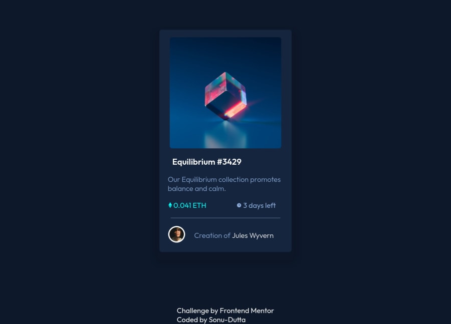
Design comparison
SolutionDesign
Community feedback
- @rouftarekPosted almost 3 years ago
Nice work. But I think you forgot the hover state.
Marked as helpful0 - @JANKEE92PLPosted almost 3 years ago
I like it, I think it looks better as the design 😂 try to play more with user interactions to get a better UX 🤓
0@Sonu-DuttaPosted almost 3 years ago@JANKEE92PL thank you for your suggestion👍😊
0
Please log in to post a comment
Log in with GitHubJoin our Discord community
Join thousands of Frontend Mentor community members taking the challenges, sharing resources, helping each other, and chatting about all things front-end!
Join our Discord
