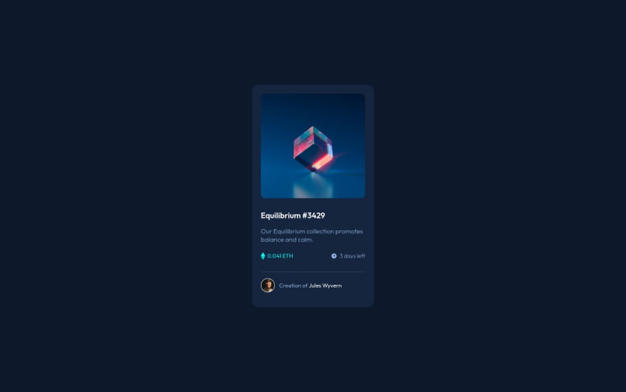
Design comparison
Community feedback
- @CodeWithAlaminPosted almost 2 years ago
Hi Ositaro👋 Great job on completing this challenge! 🥳
I would like to share a few suggestions on this solution if you don't mind.
HTML
-
Use semantic elements where appropriate. For example, you could use a
headerelement to wrap theimgelement in the.topclass and afooterelement to wrap theimgandpelements in the.downclass. This helps make the structure of the page more meaningful to screen readers and other assistive technologies. Learn more -
Use proper alt text for images. The
altattribute of animgelement should describe the purpose of the image. For example, thealtattribute for theimgelement in the.topclass could be "view NFT" and thealtattribute for theimgelement in the.downclass could be "avatar image". This helps make the page more accessible to users with visual impairments. Learn more
CSS
-
Use more specific selectors to increase the specificity of your styles. For example, you could use a class name as a selector instead of just an element name. This can help prevent your styles from being overridden by other styles on the page. Learn more
-
Consider using a CSS reset to ensure that all elements have a consistent starting point. This can help avoid cross-browser inconsistencies and make it easier to style your page. Learn more
-
Use more descriptive class names to make your styles more readable and maintainable. For example, instead of using a class name like
.up, you could use a name like.image-containerthat more accurately describes the purpose of the class. Learn more
Overall, this is a very well done solution to the challenge. Great job!
I hope this feedback was helpful. 😊 Keep up the good work!👍
Marked as helpful0 -
Please log in to post a comment
Log in with GitHubJoin our Discord community
Join thousands of Frontend Mentor community members taking the challenges, sharing resources, helping each other, and chatting about all things front-end!
Join our Discord
