Design comparison
SolutionDesign
Solution retrospective
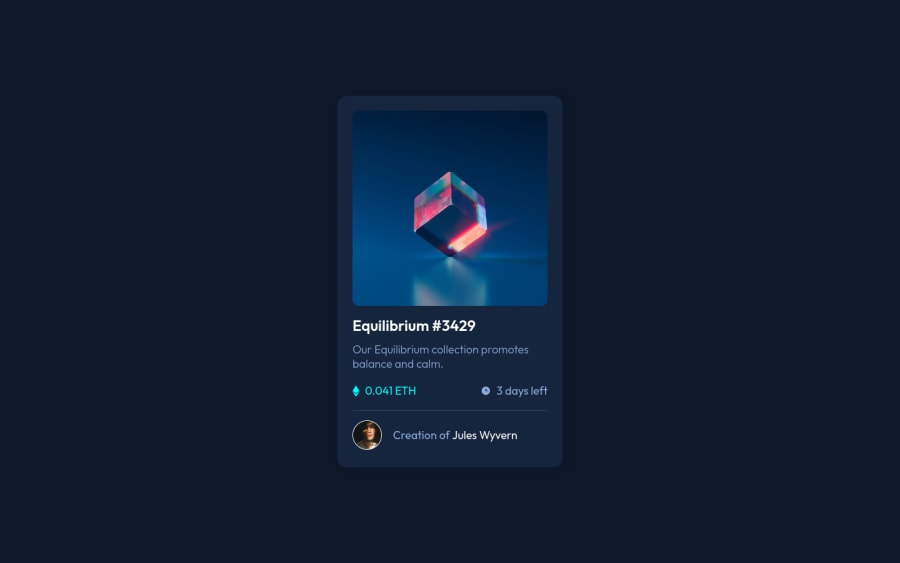
It was a little bit difficult the build the interactive image but I think it should work fine now.
Community feedback
- @Kamasah-DicksonPosted over 2 years ago
Your solution looks great but this is what I have for you.
-
Increase the width of your card but use max width instead of width.
-
your user IMG is so small, make it big and you can also add a border hover state.
-
you can also increase your box shadow. Besides good job there👍 Happy coding👍💻
Marked as helpful0 -
- @ghostpogramPosted over 2 years ago
i was looking for a way to make the view icon hover on the main image then i found your solution permit me to steal your code?
0
Please log in to post a comment
Log in with GitHubJoin our Discord community
Join thousands of Frontend Mentor community members taking the challenges, sharing resources, helping each other, and chatting about all things front-end!
Join our Discord